Render man_made=water_well #1224
Comments
|
Can you give examples? |
|
http://www.sazp.sk/slovak/struktura/ceev/DPZ/pramene/vt/hn-4.html (there is a manual pump inside a shelter, mineral warer) |
|
Sorry for being imprecise - can you give examples of OSM elements (node/way/relation)? |
|
Add amenity=drinking_water to them. |
|
maraf24, I think this would be mapping for renderer. Maybe I would also like to have different icons for mineral water sources, but for that there is no standardised tagging yet. |
|
I was merely stating the fact that your water wells lack tag for drinkable water. It could be drinking_water=yes or amenity=drinking_water. The latter has an advantage of being rendered. However the main point is that man_made=water_well is not rendered at all. Certainly, if it has drinking_water=yes it should be rendered at the same zoom level as amenity=drinking_water, maybe even with the same icon. |
|
Now what about springs and water_wells with dirty - non drinkable water? Should they be rendered? Hypotetically somebody coult even tag water source as |
If it fits definition of amenity=drinking_water - it should be tagged also as amenity=drinking_water (it sounds like a good validator rule for JOSM). Also, drinking_water is currently not available in database.
IMHO rendering it at general purpose map is a poor idea. First problem is that it would be hard to express that it is water well with dirty water, not fully usable water well. Second problem - this feature is of really limited importance - even for me it is borderline. |
|
As far as I'm concerned, it could be rendered on the highest zoomlevels as part of the mapper feedback loop. From z19, or maybe from z18. |
|
2015-01-19 11:46 GMT+01:00 maraf24 [email protected]:
can also be interesting for historic wells, I have encountered quite a few |
|
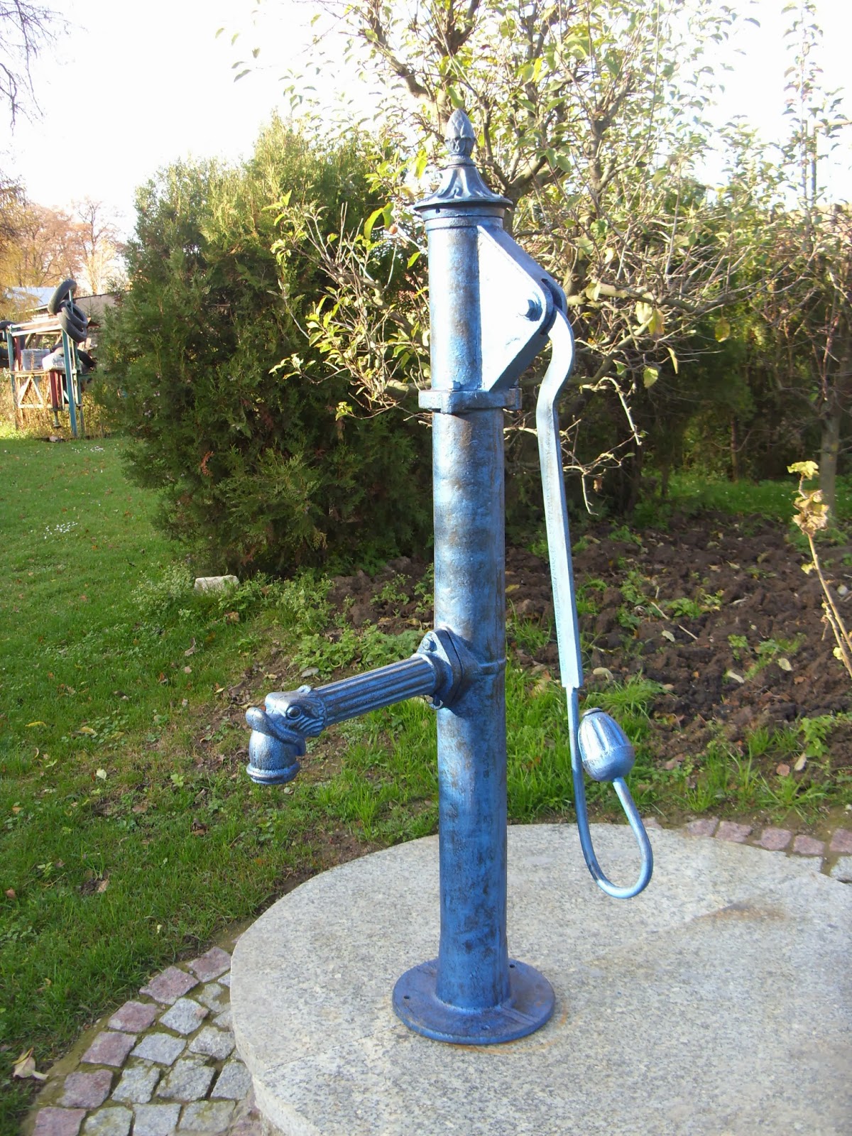
Can we get back to this topic? Now, there is over 81k of water wells. It's one of the most popular man_made=* values. There is two options of potential icon shape: What do you think? For me, a "pump" shape would be more universal and better. |
|
Note that icon must work in just 14 X 14 pixels. |
|
Here's what I went with in a different style: https://github.com/SomeoneElseOSM/openstreetmap-carto-AJT/blob/master/symbols/water_well.png . If you want to see the effect on a map find a well you're interested in in UK or Ireland and then have a look at it on https://map.atownsend.org.uk/maps/map/map.html . |
|
14x14: What are your thoughts? Is it readable enough? |


|
I like this shape in general - it's very clear for me even with 14 px matrix. It lacks solid bottom, water output should be L-shaped and be probably attached a bit higher, but these are just details. I think that pump symbol should be used only for |
|
Updated pump vector:
14x14: Gist: https://gist.github.com/Tomasz-W/b55760c0b5db057e2b6046cc3935cb21 Medieval well icon project:
14x14: Gist: https://gist.github.com/Tomasz-W/04eefd0d1f2cc60cd19660c7450a5377 I'm not sure about making two icons. I'm worried that many of pumps are tagged without "pump=powered/manual" tag, and it doesn't mean these objects have a "medieval well" shape. What about the colour? I would like to see a test rendering in two versions - man_made grey, and water blue (like fountains) |


|
Great, that's really promising!
I guess that split is OK - if this is really the pump, one needs just to add the tag and plenty of images show me that traditional well is still popular. I would use brown - man made is about things not usable for general public (just visible) and brown is for amenities, including |
|
@kocio-pl I've put both svg files on Gist. Can you do this final changes on your own hand? You are more experienced, so you know better which sizes of certain elements would work fine. For me, it would be a guesswork ;) |
|
We have also |
|
Water well: |


|
Pump: |


|
Water well: honestly, both icons are good enought, we can treat "3)" as little bit more readable, because it has less elements |
|
2018-01-23 9:08 GMT+01:00 Tomasz-W <[email protected]>:
Water well: honestly, both icons are good enought, we can treat "3)" as
little bit more readable, because it has less elements
Pump: I can see there is thicker line on the right side in "6)", but also,
both icons are good enought, but I would choose "5)"
while I find the pump well readable, it might be missleading, because a
water well is simply "a facility created to access ground water from an
aquifer." i.e. it is a shaft or a duct, a pump is an additional feature
that can be present or not.
|
|
Water well icon is meant for general cases, pump icon is for https://wiki.openstreetmap.org/wiki/Key:pump (subcase of a water well). |
|
Thanks for all the examples! |
|
Water-blue colour might be confusing as water well can be an abandoned or turned off just a free standing object. |
|
The abstract rendering is good for the basic sense of “water well”, which
literally means “hole in the ground that provides access to ground water”.
I also like how the small abstract icon looks on z16; it is still visible
in rural areas and developing countries but does not add “clutter” in
well-mapped cities. Christopher suggested rendering it at z15 too, but z16
is probably enough.
It will be intuitive if we use a similar color and style for springs, as I
recommended in that issue.
Re: “water well can be an abandoned/ turned off free standing object.”
Shouldn’t abandoned features be tagged differently?
I believe that only public, usable water wells should be rendered at most
zoom levels.
(Perhaps a broken or private pump could be rendered at z19 with man-made
gray as a minor orientation point)
…On Sat, Nov 10, 2018 at 2:51 AM Tomasz Wójcik ***@***.***> wrote:
Water-blue colour might be confusing as water well can be an abandoned/
turned off free standing object.
—
You are receiving this because you were mentioned.
Reply to this email directly, view it on GitHub
<#1224 (comment)>,
or mute the thread
<https://github.com/notifications/unsubscribe-auth/AoxshLpiMAsUV8nIXpmrUXmzEmoth2HYks5utcCSgaJpZM4DSKhw>
.
|
|
Abstract shape is totally not understandable also for me. |
|
Perhaps @Tomasz-W can design a pump that is a compromise between pump-5 and the HDM manual pump? HDM Manual Pump icon in Blue HDM Manual Pump icon in Brown HDM Manual Pump icon in Gray |


|
Abstract spring icon with drinking water supplement Above Upper left This is done with a supplemental icon, which can be moved around to different locations relative to the main icon, as desired: |


|
Hey, that's pretty snazzy. It might be a good solution to some other things also. Although, it might also give the false impression that there is another mapped poi next to the main one. Plus, it doesn't look like the position of the second rendered icon is consistent every time. |
|
As I very like dot-rendering for some features on z17, because it's the simplest possible shape, I consider different icons for the same feature at different zoom level as bad idea:
|
|
Do we have a common denominator to proceed? I agree: showing same feature with different icons at different zoom level is a bad idea. I just want to point to the fact, that the lack of a water well icon in Carto style obviously leads to "tagging for the renderer", where mappers just tag water wells as amenity=fountain or drinking_water. And as you know, there are currently >111 K objects tagged man_made=water_well in OSM. And it's mentioned in https://wiki.openstreetmap.org/wiki/Map_Features . |
|
Owing to the large abundance of this tag, why not using three distinct icons with regard to the tag
|
|
For the record, there is a proposal related to pump features : https://wiki.openstreetmap.org/wiki/Proposed_features/Pumping_proposal This also applies to |
|
Is anybody still working on this topic? |
|
Speaking for myself only - i have on my todo list the idea to further explore the concept of compound symbols (for amenity=drinking_water/drinking_water=yes in combination with man_made=water_well/man_made=water_tap/natural=spring but also for things like amenity=watering_place - see #3703 (comment), #4441 (comment)) Someone working on a suitable implementation of rendering man_made=water_well would definitely be helpful. But as you can see above there is no consensus among the maintainers how this should look like. I would not mind a solution different from my implementation but it would have to be non-misleading (in particular regarding confusion with man_made=water_tap - see #3011) and culturally generic so it is suitable for all kinds of wells in different settings. The solution i showed (http://blog.imagico.de/the-way-of-the-water/) has in particular the advantages of
|
|
This is just for your information in support of this proposal - especially imagico's - in addition to my arguments here #1224 (comment) . Currently there's a proposed tag man_made=borehole [1] and the Project of the month Switzerland of October 2021 [2] will be "Fountains" including amenity=fountain and others like amenity=drinking_water / water_point and man_made=water_well / water_tap. I know well the burden of volunteered maintenance. But the fact that only amenity=fountain and amenity=drinking_water (from the above list) are rendered in OSM carto style - although proposed since 6 years - means, that we need additional energy now, motivating mappers and preventing newcomers not to map for the renderer. [1] https://wiki.openstreetmap.org/wiki/Proposed_features/Bore |
|
I completely concur that rendering natural=spring and amenity=fountain but not man_made=water_well creates negative mapping incentives. To make this clear for everyone who might be interested in working on this: For adopting the design approach for springs, wells and fountains (+ potentially geysers) i showed in http://blog.imagico.de/the-way-of-the-water/ there is essentially only one prerequisite: Making bright and strong blue color for symbols exclusive to water features. Currently there are four different bright and strong blue colors used in this style and three are used for water related features - transportation, spring, waterfall and fountain all have different colors. Transportation would need to be moved to something non-blue (the airport/ferry terminal violet is an obvious choice), spring and fountain would be unified into a new water symbols color. The dark blue used for offices is sufficiently far away from that to not cause problems. I know that this would still be a huge change for the overall appearance of the map - the blue transportation/accommodation symbols have been a trademark design element of this style since the beginning. But i am pretty sure that not overloading the full spectrum of colors for point symbols but limiting this more and aligning the choice of symbol colors to the choices of fill colors for polygons and line colors to some extent (i.e. blue for water related features, green for vegetation related features) is very helpful for map readability and clarity. We have taken this step a long time ago for roads already - moving from the colors-of-the-rainbow scheme with blue motorways, green trunk and red primary to the current red-orange-yellow-white gradient which most consider now a very good move for map usability and maintainability. The optimal choice of water symbol color will depend a bit on the water color scheme, i.e. #4128. But that is just fine tuning. |
Seems like a good idea to me, and I see no big problem with
|
|
My use is both in medieval setting as a true well (like Burcht), and as a pump in historic setting like on squares or community gardens (Sint Annahofje.) This topic is around since 2015! There are a lot more of them. |
Agreed. But now we are so close. And hope springs eternal! |
Many famous mineral water sources are tagged as man_made=water_well so they should be rendered on OSM.
The text was updated successfully, but these errors were encountered: