-
Notifications
You must be signed in to change notification settings - Fork 1
MDI Dialog Window Service
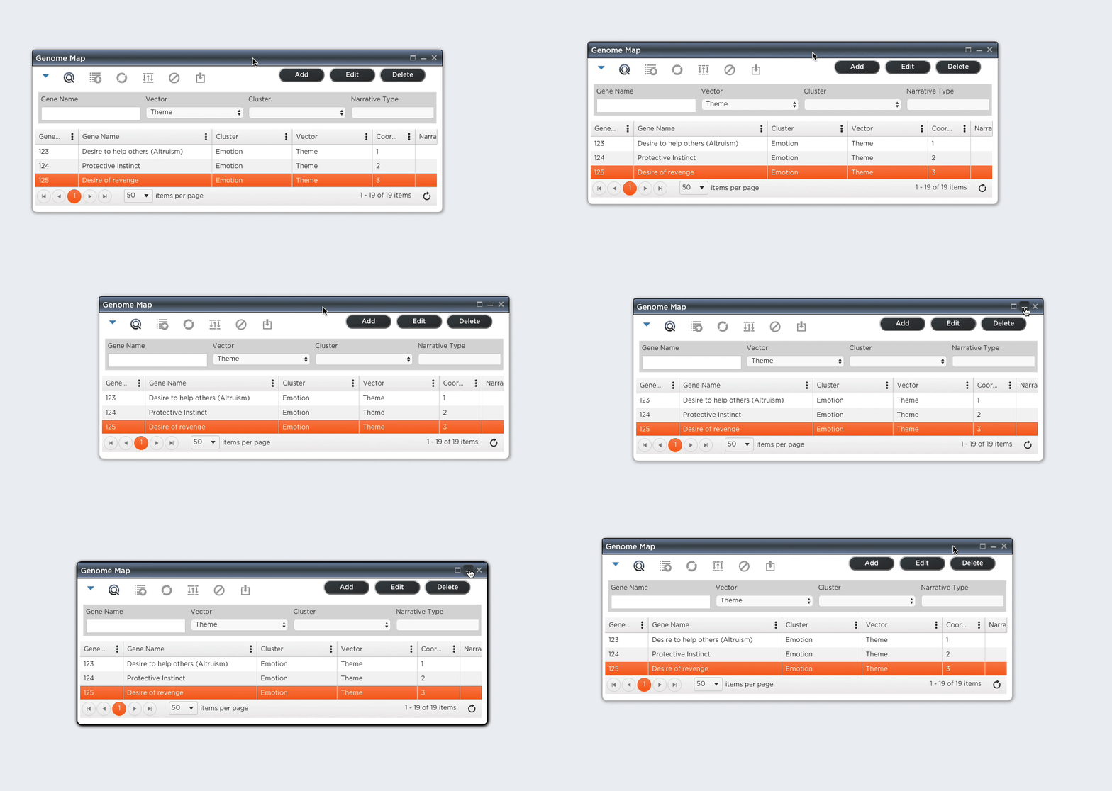
The library includes a set of service classes that are used for opening movable windows, which can be modal or not.
Example:
The service is comprised of a provider class, Modal, and auxiliary classes ModalConfig and ModalDialogInstance.
Modal is the provider class one uses to open and start a Dialog Window. It uses a kendo-ui window widget to build and control the dialog window.
Here is an example on how to use it:
import { ViewContainerRef } from '@angular/core';
import { Modal } from 'js44D';
import { LoginComponent } from '...';
...
   constructor (private modal: Modal, private hostViewRef: ViewContainerRef) {
...
        this.modal.openInside(<any>LoginComponent, this.hostViewRef, null, LoginComponent['dialogConfig'])
            .then((result) => {
                switch (result) {
                    case 'loggedin':
                        this.userHasLoggedIn();
                        break;

                    case 'signUp':
                        this.showSignUpDialog();
                        break;
                }
            });
This function will open an independent Dialog Window, and it takes the following arguments:
- componentType: The angular Component Class to render as the Dialog Window contents.
- parameters: parameters to be passed to the dialog instance.
- config: A Modal Configuration object (see below).
- allowMultiple: indicates if multiple version of the same dialog are allowed; default is false.
- dialogID: a dialog identification token to control multiple occurrences.
The function will return a Promise, that caller can subscribe to and act upon when the Dialog Window closes.
This function will open an independent Dialog Window, and it takes the following arguments:
-
componentType: The angular Component Class to render as the Dialog Window contents, the class must have a static ModalConfig variable named
dialogConfig. - parameters: parameters to be passed to the dialog instance.
- allowMultiple: indicates if multiple version of the same dialog are allowed; default is false.
- dialogID: a dialog identification token to control multiple occurrences.
The function will return a Promise, that caller can subscribe to and act upon when the Dialog Window closes.
This function will open an independent Dialog Window, and it takes the following arguments:
- componentType: The angular Component Class to render as the Dialog Window contents.
- viewRef: the ViewReference where the dialog is to open into, be a child of.
- parameters: parameters to be passed to the dialog instance.
- config: A Modal Configuration object (see below).
- allowMultiple: indicates if multiple versions of the same dialog are allowed; default is false.
- dialogID: a dialog identification token to control multiple occurrences.
The function will return a Promise, that caller can subscribe to and act upon when the Dialog Window closes.
This class defines the properties of a Modal Dialog. It can be declared as a static variable, named dialogConfig, on classes representing Modal Dialog contents, which can then be opened via a call to modal.openDialog().
The class has the following properties:
- title: the dialog title
- isModal: if set to true indicates that the dialog window is modal; it can be closed by clicking outside the window
- isBlocking: A Blocking modal is not closable by clicking outside of the modal window
- isDraggable: indicates if dialog window is draggable, movable
- isResizable: indicates if window is resizable
-
position: an object with 2 properties:
- top: top window position, relative to the browser window; default 100px
- left: left window position, relative to the browser window; default 100px
- selfCentered: if set to true, dialog will be self centered into the browser window when opened (position, if set, will be ignored)
- width: window width, in pixels
- minWidth: minimum window width, in pixels, used when resizing window
- height: window height, in pixels
- minHeight: minimum window height, in pixels, used when resizing window
-
keyboard: keyboard key that closes the window, default is
27(escape key) -
actions: a string array listing allowable window actions, which are represented by buttons on the window's top right corner:
- Maximize: window can be maximized; maximize button will be enabled
- Minimize: window can be minimized; minimize button will be enabled
- Close: window can be closed; close button will be present
