List Selector Dialog
This is a self-contained Dialog Component that provides UI and functionality for displaying a modal dialog with a list of items for users to select from.
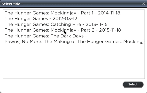
Example:
And here is a sample usage of the List Selector Dialog:
import { ListSelectorDialog } from 'js44D';
...
constructor(private selector:ListSelectorDialog) {}
...
   this.selector.title = 'Select title...';
   this.selector.width = 600;
   this.selector.show(titleList, tipsList)
       .then(index => {
            // index has the selected item's index
            });
A ListSelectorDialog instance has the following properties:
- title: the modal dialog title, default is "Select..."
- width: the modal dialog width, in pixels, default is 400px
- height: the modal dialog height, in pixels, default is 350px
A ListSelectorDialog instance provides the following functions:
This is the function one uses to bring up and display a selector dialog. It takes two arguments:
- itemsList: a string array, with the list of items to display in the dialog (it is a single column list)
- itemsTips: (optional), also a string array, with a list of tips for each item on the selector list; will be used as a tooltip for each item
- message: (optional) message text to be displayed at the bottom of the list
- buttonLabel: (optional) the label for the button at the bottom; default is "Select"
The function returns a Promise, which users can subscribe to, and whose result is the index for the selected item.