Conceptual problems with the Mobile theme #1336
Comments
|
I assume some of the stuff that is broken or weird looking could be a conflict between bootstrap and jQueryMobile. It might be worthwhile to try disabling bootstrap in the mobile theme entirely since it is built to use jQueryMobile, which is a "competing" paradigm. I think your title summarizes the problem well - the concept is poor. But some of this is a product of the fact that most web development until the last 2 years or so has focused completely on desktop browsers. Now we are more and more concerned about mobile browsers and Zikula doesn't iterate fast enough to keep up with this need (both core and modules). Since Bootstrap is now an integral core technology and Bootstrap is famously "mobile first" then we must leverage that advantage. The core themes need to be "bootstrapped" and this will eliminate the need for a "mobile" theme as the regular theme will automatically adapt to the mobile browser. Modules will need to adjust (over time) in a few areas, but not too much probably. |
|
So you basically say: Drop the Mobile theme. Bootstrap themes and modules. It will be mobile first then without any other magic like jQueryMobile, right? |
Yes, I agree with that, been spending a lot of time lately trying to fully understand Bootstrap 3.0 and it is quite a shift on how to handle various browser window sizes. The shift is to no longer think of "phone view", unless you are talking about the old WAP (fip phone) displays. Instead think of making the content display well on all browser viewport sizes. This means you don't have to maintain two different themes for the same content. "Gentlemen, we can rebuild these themes. We have the technology. We have the capability to build the world's first fully responsive application framework. Zikula will be that framework. Better than it was before. Better, stronger, faster." |
yes, that is essentially what I am saying. Although I am no expert, I believe that is the point of Bootstrap. I was hoping @phaidon would contribute his thoughts as well. |
|
I thought a lot about this topic. Here my current state: We should drop jQueryMobile
So can we drop the mobile theme and let bootstrap do everything?I think for moment no:
So what should we do?I suggest to make the current themes mobile ready with bootstrap. But in addition would leave the mobile theme, but without jquerymobile. Maybe we should offer the modules the possibility to provide a mobile template. |
|
@phaidon - are you back up and running? new computer? |
Not really. I just borrowed one for the moment. I was to busy in the last days to take care about it in the last days. |
I don't understand what you mean by a mobile theme without jquerymobile. |
You dont need a jquerymobile to make a mobile theme. See for example here: |
visit this site on both your computer and your phone at the same time: http://startbootstrap.com/templates/business-casual/ Bootstrap allows you to create one site that automatically adapts to the screensize you are viewing it with. so you don't need another subdomain or special url for the mobile viewer. |
|
Nice example, @craigh |
|
Yes, I know the Bootstrap mobile first stuff. I don't get the point why we should keep the Mobile theme (refactored, without jQueryMobile) AND refactor our core themes. |
|
imho we don't need a special Mobile theme without jQuery mobile anymore if other themes provided by the core are able to be used on a small viewport with a pleasing experience. Keeping the Mobile theme including jQuery mobile would be a benefit, but still not required |
There are compatibility issues with bootstrap.
Two reasons:
|
|
After thinking long about the whole topic, I agree to drop the jquery-mobile and the mobile theme. There are conceptional problems with the mobile theme. So I suggest to go mobile first, too. If I read the topic right we have all now the same opinion. Or did I missed something? If there are no negative posts in the next days I will make a pr to drop it. |
|
yes, I think we all agree now. @cmfcmf ? |
|
Right 😃 |
|
I agree to drop the "Mobile" theme and go mobile-first. |
|
good On 24 May 2014 05:07, Shefik [email protected] wrote:
|
There are some minor and major problems with our Mobile theme and how it is implemented at the moment:
overrides.ymlby hand _for every_ template of _every single module_ providing mobile templates.Ideas on how to avoid broken pages
A: Remove the Mobile theme.
B: Absolutely require every module to have Mobile templates.
C: Introduce a parameter in
Version.phpof each module saying if it supports the Mobile theme or not. If this parameter isn't set totrue, a<div data-enhance="false>{$maincontent}</div>will be automatically added around the{$maincontent}variable, preventing jQueryMobile from enhancing the output.D: Add an annotation which can be used in Controllers to specify if the action has a mobile-optimized template. If this annotation isn't located in the action's docblock, a
<div data-enhance="false>{$maincontent}</div>will be automatically added around the{$maincontent}variable, preventing jQueryMobile from enhancing the output. Note that you still would have to move and override the templates to the Mobile theme.E: In addition to D, auto-load the mobile-optimized template. This means:
The Mobile theme will still load, but a
<div data-enhance="false>{$maincontent}</div>will be automatically added around the{$maincontent}variable, preventing jQueryMobile from enhancing the output.The
$this->view->fetch('MyTemplateName.tpl');method will alter the path toMobile/MyTemplateName.tpland render the mobile-optimized version of the template instead of the normal one.Notice that the templates stay in the module, the end-user has ZERO extra work by this. This was basically what I wanted to say in Think about [Mobile theme] and template overwriting #701.
I hope you get the point, if not, please feel free to ask as much questions as you like!
BAD looking
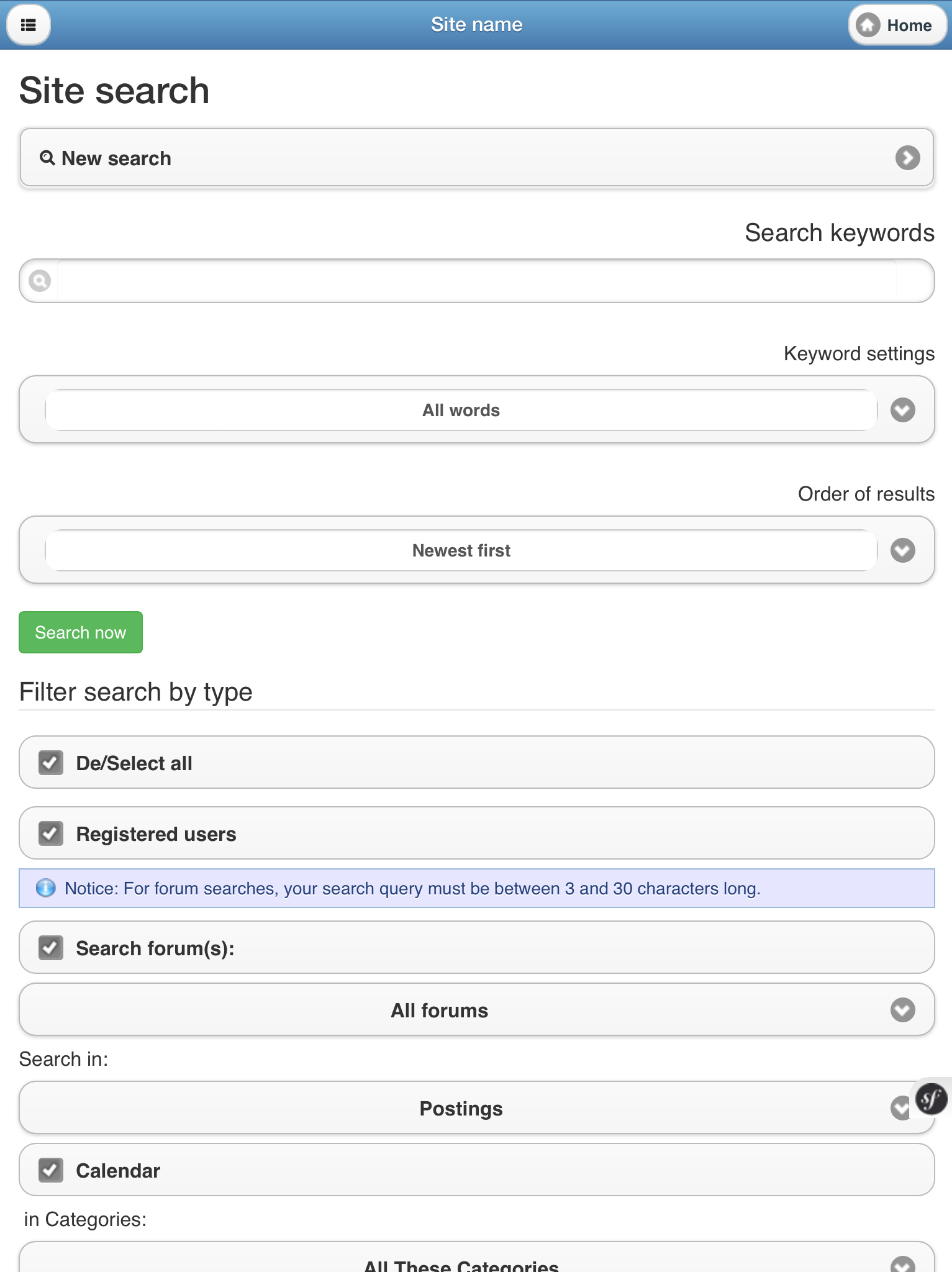
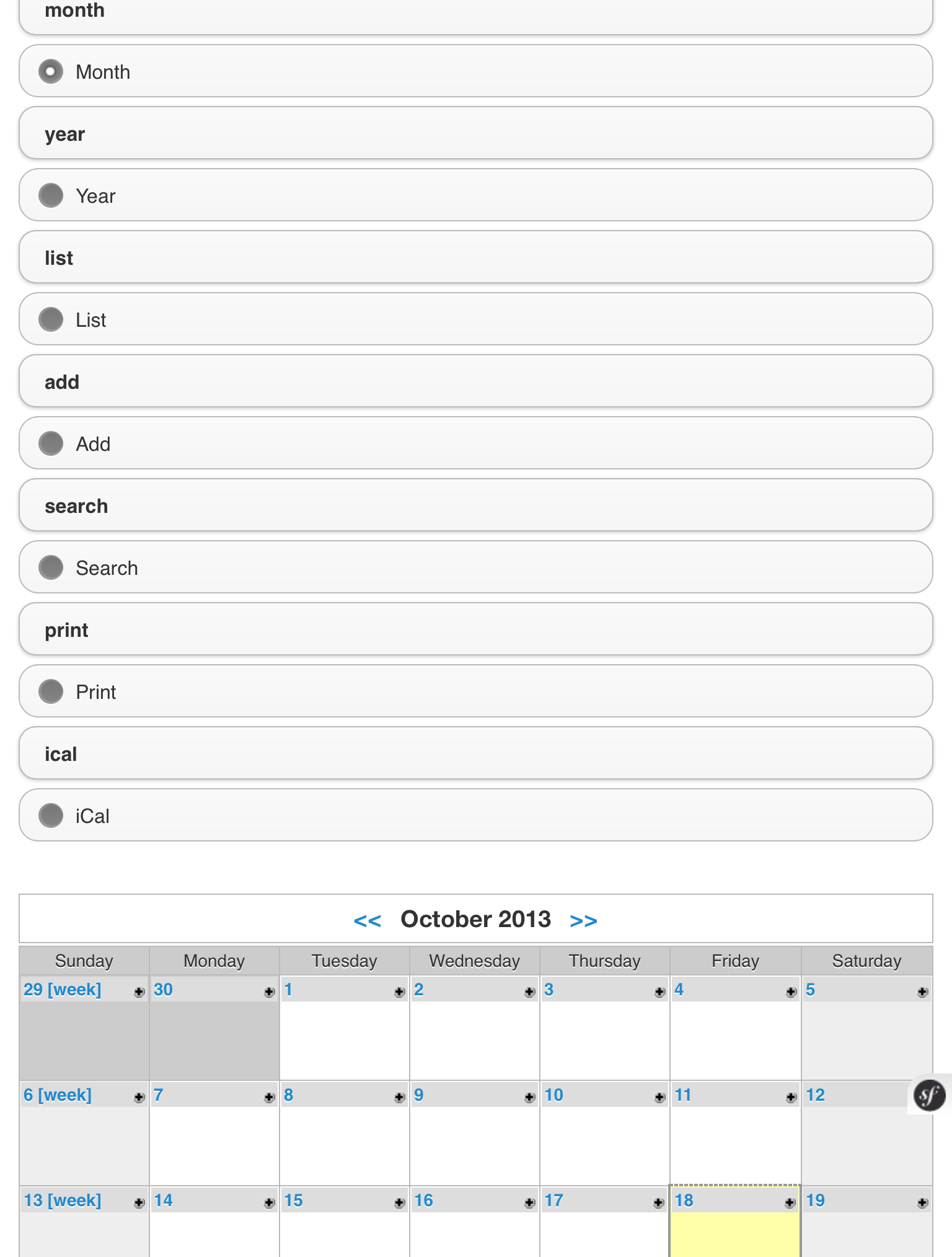
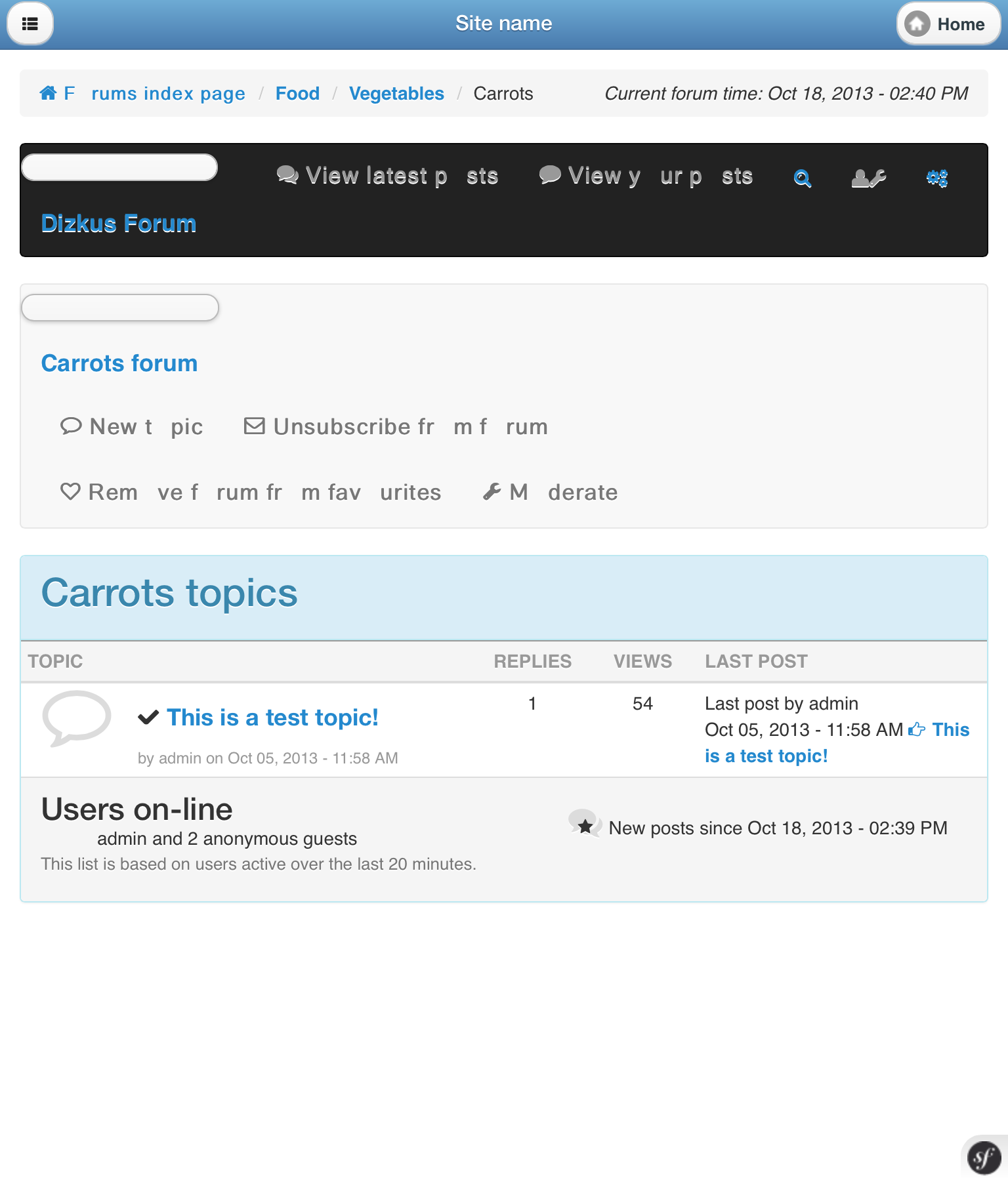
Search
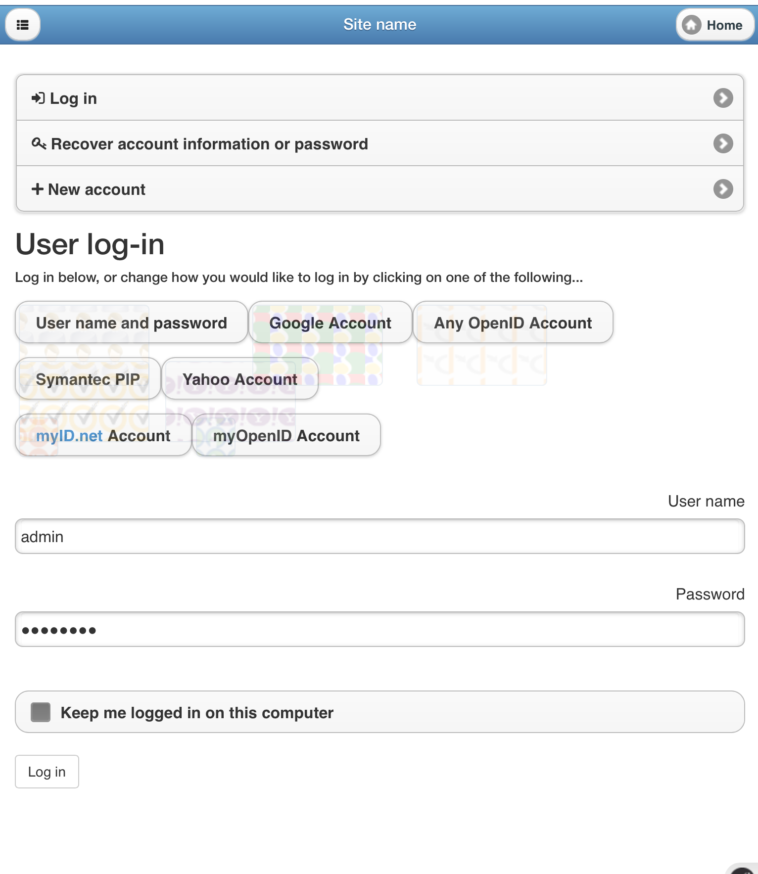
User login
PostCalendar
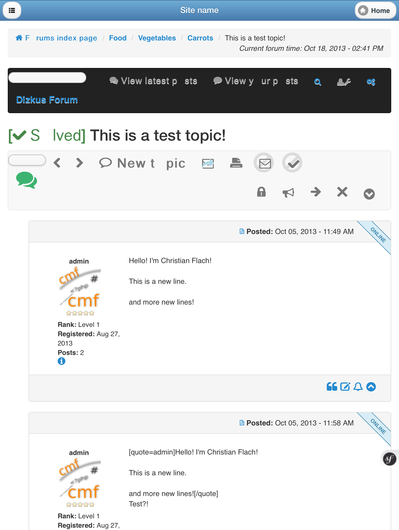
Dizkus
GOOD looking
Adminpanel
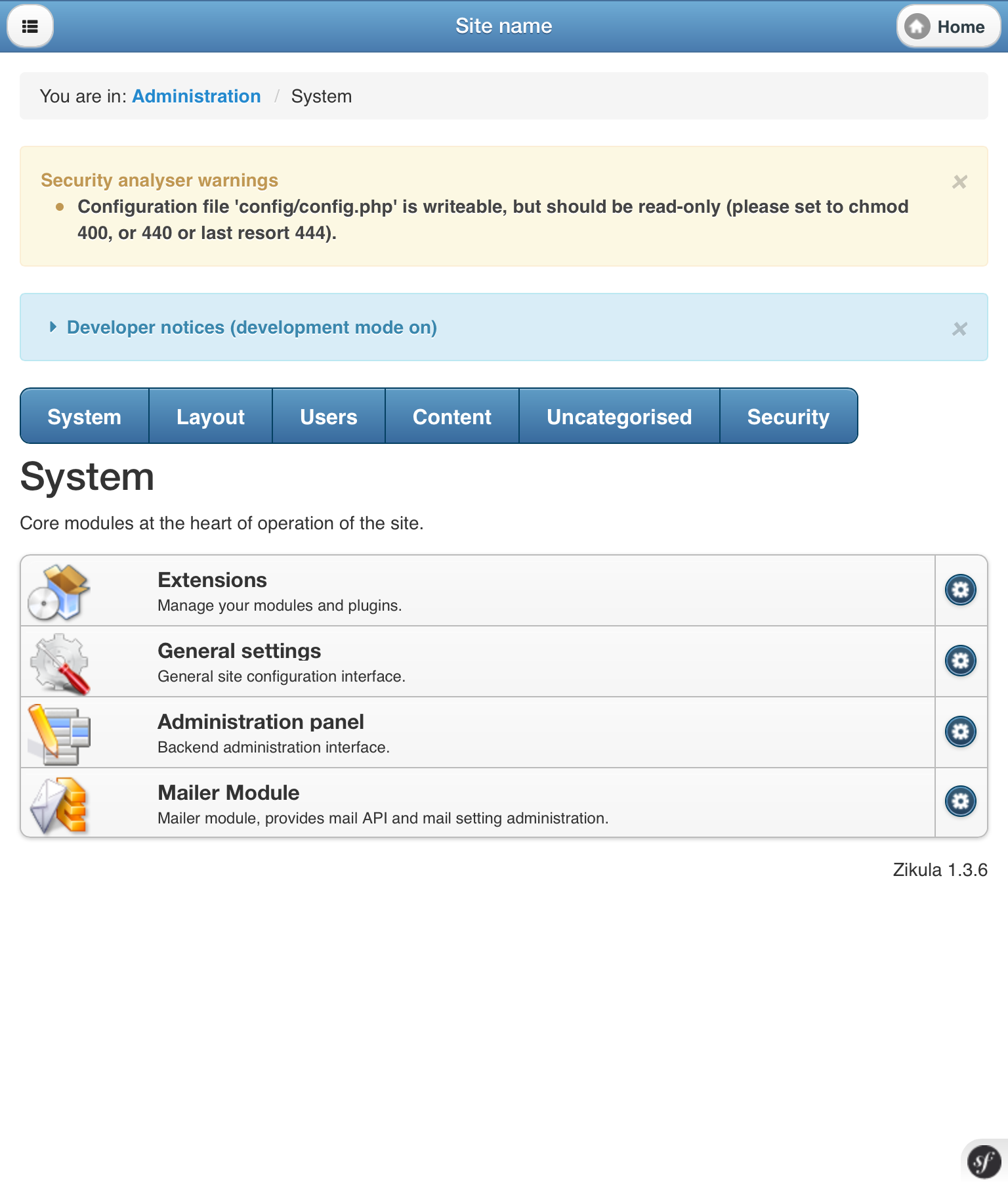
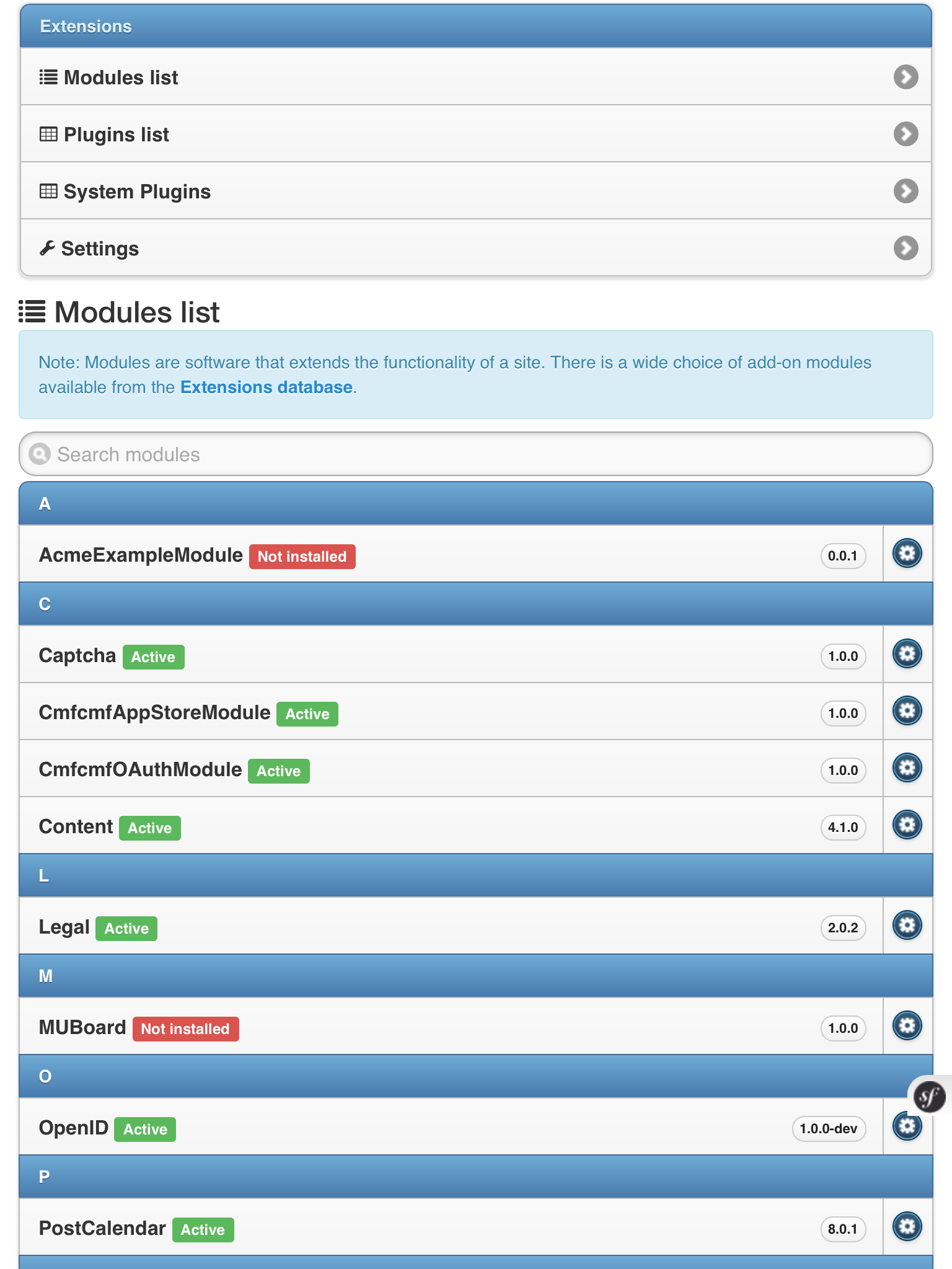
Extensions overview
The text was updated successfully, but these errors were encountered: