You've entered a contest in which you're competing against other web developers to design the perfect layout for an upcoming startup's website. The below exercises will serve as training and stretch exercises to get your skills up to speed and you ready to compete.
You'll be working through replicating each of the mockups below in different css files. You'll be given the HTML and some basic style (such as background color of divs), but it's up to you to transform a plain page of squares into the layout you see in the images. The basic styling is contained in basic.css and once you've finished the lab you can check out the file to learn more about what's happening inside of it! For now, you can ignore the file as it isn't related to CSS Grid!
This link might be helpful as you work through the lab.
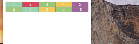
For level one you'll be working in the level_one.css file to style the level_one.html file. For this first layout you'll want to focus on grid-template-columns and grid-template-rows. The end goal for this level is a simple row (with a height of 100px) with four columns (each with a width of 50px).

One row of divs is great, but to make things more interesting for our player, we want to give them something that looks a little bit more like a board. For this, you'll be using the same properties that you worked with in the last level, but you'll want to create two rows, each with a height of .5fr. Each row should have 5 columns in it, each with a width of 1fr.
See if you can incorporate the use of the repeat keyword into this style! An example of how to use this has been included below.
/* the following line of CSS would result in 10 rows width a height of 10 pixels! */
grid-template-rows: repeat(10, 10px)These grids have been looking great, but you may have noticed that all of our columns across rows up until this point have been equally sized. While this type of styling might be useful for something like a table, it's not very interesting visually. Here's a sneak peak and what you'll be moving towards:
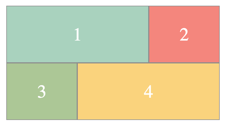
Let's switch it up by using the grid-column-start and grid-column-end properties. When designing these kinds of grid layouts you'll complete two steps:
- Style the container element to have the correct grid lines
- Style each grid element to span the correct number of lines.
First, style your container in level_three.css to build a grid with three columns that are each 1 fraction of the page and two rows that are each 100px tall.

Next, we'll style each individual element. Use the grid-column-start and grid-column-end properties to copy the grid you see below. The larger blocks are spanning two columns from the original grid you created above and the smaller are spanning only one.
Now that we've looked at having items span multiple rows, lets step it up a big and try to create something that resembles a website layout we might actually use. In this case you'll be following the same steps as above, creating the grid layout for the container, then styling each individual item, but you're free to use either all of the properties below:
- grid-column-start
- grid-column-end
- grid-row-start
- grid-row-end Or the shorthand properties:
- grid-column
- grid-row with any of the acceptable value types. Check out the help link at the top for detailed information on both types of syntax.


Recreate the same grid as above, but this time do it using only two columns... Try to accomplish this by explicitly sizing the sidebar column, and then using auto to allow the second column to take up the remainder of the space. Your final product should look the same, but this exercise will get you used to using varying sizes of columns as opposed to multiple equal sized ones!
In some cases, you may find it easier to accomplish these layouts using a different css grid property. Choose your favorite exercise from above and try using a combination of grid-template-areas and the existing grid-template-columns and grid-template-rows in your container element and replacing all of the individual styling you did above with a single grid-area rule for each item. You should be able to achieve the same layout that you did previously!
Now that you've had some time to work on your core css grid skills, it's time to explore some of the other cool features that this styling technique offers. In this exercise you'll be putting together the properties you used to make individual items span a certain number of rows and columns, as well as some new techniques to make the page more responsive. You'll be working in level_five.css and level_five.html
-
Columns should have a minimum width of 100px and a maximum of 1fr. The minmax property can help you here.
-
The grid that you're building here won't be the same as the grids we've built above because you will need the number of columns and rows to change dynamically. Check out this link for information on the auto-fit and auto-fill properties.
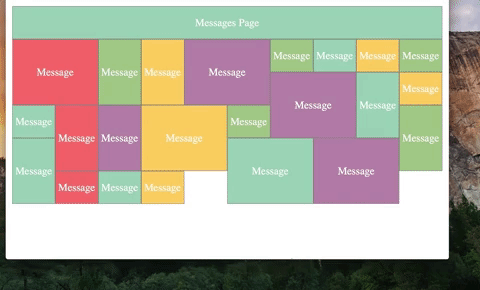
This will be a messages page, where family members can write happy birthday messages and sign the scrap book.You've been given a general format in the format_four.html and format_four.css files. You'll need to replace the large "messages" block with 15 or more individual message blocks. The class of each box should signify which kind of family member has written the box. (In other words, add 15 divs with messages in them and a classname related to the family type of the person that submitted the message). Each type of family member has requested the following amount of space:
- Siblings: Span 2 columns, but one row
- Aunts and Uncles: Span 1 column, but two rows
- Grandparents: Span 2 columns and two rows
- Cousins and friends: One row, and one column