Windows Phone in desktop mode doesn't pickup viewport bug fix #12285
Comments
|
Please read the "Internet Explorer 10 in Windows 8 and Windows Phone 8" section on that page of the docs. |
|
That fix did it, however the code snippet provided on the page is not 100% accurate. The is required or Windows Phone 8 users in desktop mode will not be able to view the page properly. Tested on Lumia 1520 (WP8) and Lumia 900 (WP7). |
|
If the phone is in desktop mode, why would it be a problem that it doesn't get the mobile view? |
|
Although, we include the hack/fix on our docs site, so I'm not sure why your screenshot looked like that. Which mode did you have the browser in when you took that screenshot? |
|
The problem in desktop mode is that the view gets mixed between mobile and desktop view. |


Nope, we didn't change anything. |
|
@DomiStyle can you check this on your device: |
|
User-Agent docs: http://developer.nokia.com/Community/Wiki/User-Agent_headers_for_Nokia_devices Unfortunately, the WPDesktop version of the user agent string doesn't seem to include a browser-specific version number, which will make it harder to apply the fix only to the versions affected by the bug. |
|
Relevant blog post, although I don't think the fix shown is acceptable: http://www.markadrake.com/blog/2013/05/31/responsive-design-concerns-for-windows-phone-and-ie-compatibility-modes/ |
|
@carasmo This won't work as it is not targeting the WP device in desktop mode with /IEMobile/10.0/ I tested the Bootstrap page with both devices again and came up with this: Lumia 900 (WP7) in mobile mode: Mozilla/5.0 (compatible; MSIE 9.0; Windows Phone OS 7.5; Trident/5.0; IEMobile/9.0; NOKIA; Lumia 900) Lumia 1520 (WP8) in mobile mode: Mozilla/5.0 (compatible; MSIE 10.0; Windows Phone 8.0; Trident/6.0; IEMobile/10.0 ARM; Touch; NOKIA; Lumia 1520) The fix is not necessary for IEMobile 9.0 and none of the user-agents overlap when using WPDesktop as in According to the Nokia page WPDesktop is only used on WP8 devices, WP7 uses ZuneWP7 and XBLWP7 instead. Also, depending on the zoom level of the Lumia 1520 on page load the view changes:
I also tested the JavaScript snippet I posted on the getting started page: Which makes the look page look good on both devices in both modes when used with the CSS snippet posted in the Bootstrap documentation: Maybe someone else with a different Windows Phone device (maybe even non-Nokia?) could confirm if it works, most user-agents I found are Nokia devices. |


|
@DomiStyle I take it that your WP8 phones aren't running Windows Phone 8 Update 3 AKA General Distribution Release 3 (GDR3)? |
|
@cvrebert The 1520 is running Nokia Black, which is GDR3. |
|
X-Ref: #10497, so I don't have to go hunt around for it tomorrow. |
|
@DomiStyle Are you able to run the docs site locally, so as to be able to test a fix if we formulate one? |
|
Yes, I can set it up. |
|
Also it should probably be noted that the software version on the Lumia 1520 is 8.0.10517.150 rather than 8.0.10512. |
|
According to this update in October, 2013 this bug was fixed in the release: 8.0.10512 Have you tried removing it all together? |
|
I guess the bug was not fixed in 10517 (which came out before 8.0.10512 by the way), if I remove it the page stops working in both views again. |
|
Don't users get an update that automatically happens or does it work differently on mobile devices? |
|
Nokia usually keeps an own version of Windows Phone 8 just for their devices which comes with alot of stuff that Windows Phone on its own lacks. |
|
So, as a Lumia 1520 user, I thought I'd throw in my $0.02. About the GDR3 thing: The Lumia 1520 shipped with a pre-release GDR3, which is not the final. The final version is 10521, which you should be able to update to, as AT&T has shipped it. That's the version I am running on mine. Regarding "Desktop mode" on this particular device, I personally think that, since it is a 1080p screen, it should render just like I would see it on a 24" 1080p monitor. Unfortunately, that's not what happens. If you load the page vertically and wait until it loads all the way, then rotate it horizontally and pinch-zoom out, it almost renders the way you would expect. But because of the CSS calculations, the navbar and jumbotron only render the visible width and not the actual width. The behavior is similar to #12285 (comment), but I get slightly different results. So while the proposed proposed JavaScript change works, I don't necessarily agree it is the proper fix. I think you guys (twbs) need to download the new Windows Phone emulators for 1080p devices and work on specific fixes for desktop mode. I would imagine that Android phablets should also be tested in this manner. HTH |
|
According to this: http://devhammer.net/responsive-design-fix-for-windows-phone-8-device-adaptation
So, since it's the pixels that are making this not work, would changing the media queries to ems work? Can anybody test this theory? Also, though a user may want to have a desktop experience when using the desktop mode would that not require some scripting to remove the meta tag:
|
|
Hello, i don't understand why the docs have fixes (for example for ie10) but these fixes are not included in the source. |
|
@bassjobsen I think it's because user-agent sniffing is considered sufficiently hacky that we don't want to include it. |
|
I understand that you don't like the solution, but why would you ship it broken on a specific device because the solution feels hacky. Fix it, call out that it's a hack in the code, and if you find a better solution, replace the fix. Don't break the experience on 75M phones because you don't like the solution. |
|
I agree with @advancedrei, i think inclusion stimulates to find a better solution. |
|
I too agree with @advancedrei, please fix it. |
|
There's really no place to put the browser sniffing to do this. I don't see a need to create a plugin to do it, and there's no where else to include the JS fix for this that our docs mention. Punting for now since there's no better solution at this point. |
|
This was driving me insane, I have been looking for a solution to this for ages, thank you all guys. This 100% worked for me and fixed my problem.
and
I thought I was somehow using bootstrap wrong or something. I just could not figure out why my text appeared to be overflowing off the webpage on the Nokia lumina. when everything else scaled fine. |
I recently received a Nokia Lumia 1520 but I can't seem to get it working with any page that utilizes Bootstrap 3.
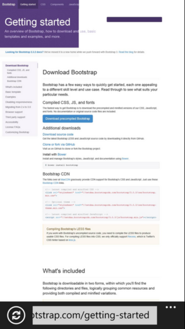
While a few Bootstrap 2.3.2 pages out there work just fine it seems to be mostly Bootstrap 3 having problems with it.
The problem appears to be that Bootstrap doesn't recognize the Lumia as phone at all but rather as desktop due to the 1080p resolution.
Could also be a problem with IE 10 not being able to handle the 1080p resolution very well yet.
I attached a screenshot of the Bootstrap 3 getting started page (http://getbootstrap.com/getting-started/) from the 1520.
You can clearly see that the desktop version is loaded by Bootstrap, which results in a somewhat mixed mobile/desktop experience.
The text was updated successfully, but these errors were encountered: