
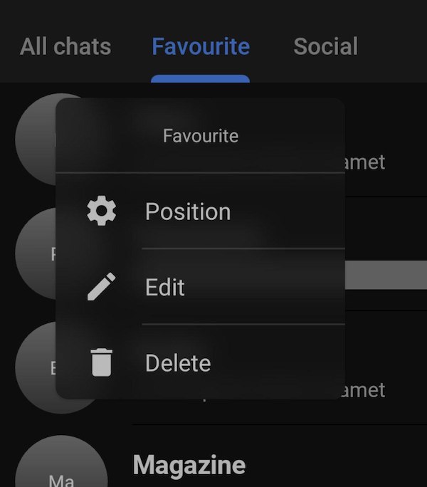
My vision of popup menu design from material.io
- The menu should be able to add a title;
- Each menu list item should be highlighted with a Material Divider;
- Each item in the menu list must have a title and an icon;
- The menu background should have a slight blur;
 |
 |
|---|
Add it in your root build.gradle at the end of repositories:
allprojects {
   repositories {
   	...
	maven { url 'https://jitpack.io' }
   }
}
Add the dependency
dependencies {
   implementation 'com.github.tompadz:MaterialPopupMenu:1.0.2'
}Create xml menu file
<menu>
   <item
      android:icon="@drawable/ic_settings"
      android:title="Position" />
   <item
      android:icon="@drawable/ic_edit"
      android:title="Edit" />
   <item
      android:icon="@drawable/ic_delete"
      android:title="Delete" />
   <item
      android:icon="@drawable/ic_search"
      android:title="Search" />
</menu>
Create and show popup menu
private fun showMenu(view: View) {
   val menu = MaterialPopupMenu(
      context = this,
      view = view,
   )
   menu.addMenuAndShow(R.menu.menu)
}To customize the menu, you need to create a configuration and pass it to the menu constructor
val config = MaterialPopupConfiguration.Builder()
       .setTitle("Actions")
       .blurEnable(true)
       .build()

val menu = MaterialPopupMenu(
      context = this,
      view = view,
      config = config,
)| Code | Description |
|---|---|
| .setTitle(string?) | Sets the title for the menu. Title will be hidden if its value is null Default null |
| .blurEnable(boolean) | Turns on and off the use of blur when setting the background color. Default true |
| .setBackgroundColor(Int?) | Sets the background color value, if null, takes the surface color value from the theme Default null |
| .setItemTextColor(Int?) | Sets the color value for the list items, if the value is null sets the onSurface color from the application theme Default null |
| .setBlurRadius(float) | Sets the background blur radius value if .blurEnable(true) Default 50f |
| .setBehindDimAmong(float) | Sets the value for dimming the background when a menu appears. Default 0.3f |
There are many ways to show a menu, the easiest one is to call the menu.addMenuAndShow(R.menu.menu) method
It is not necessary to call the menu immediately after creation, it is possible to separate these functions
val menu = MaterialPopupMenu(
     context = this,
     view = view,
)
menu.addMenu(R.menu.menu)
....
menu.show()
Since the menu is a PopupWindow, you have the ability to call the menu in any possible method from the api
val menu = MaterialPopupMenu(
     context = this,
     view = view,
)
menu.addMenu(R.menu.menu)
....
menu.showAsDropDown(view)to handle clicking, you need to call the setOnMenuItemClickListener method on the menu.
menu.setOnMenuItemClickListener { menuItem ->
  Snackbar.make(this, view, menuItem.title !!, 1000).show()
}For displaying a blur as a menu background, I use a great library RealtimeBlurView