-
Notifications
You must be signed in to change notification settings - Fork 4.4k
New issue
Have a question about this project? Sign up for a free GitHub account to open an issue and contact its maintainers and the community.
By clicking “Sign up for GitHub”, you agree to our terms of service and privacy statement. We’ll occasionally send you account related emails.
Already on GitHub? Sign in to your account
Add new ring utilities for custom focus styles and rounded outlines
#2747
Conversation
|
@adamwathan I wonder why |
|
Down Vote 👎 to remove I guess A simple code search shows 261,717 results for 'shadow-xs', which means those 261k files are going to break. |
|
You can add it back to your config file if you want to very easily 👍🏻 we added shadow-xs for a very specific use case we had which was to add a 1px semi transparent border, and stack it with other shadow using an extra element. It's much cleaner to implement as a ring, and lets you avoid adding an extra div just to stack the extra shadow. It's a 1px solid shadow with no offset and no blur, so it's definitely a ring. |
|
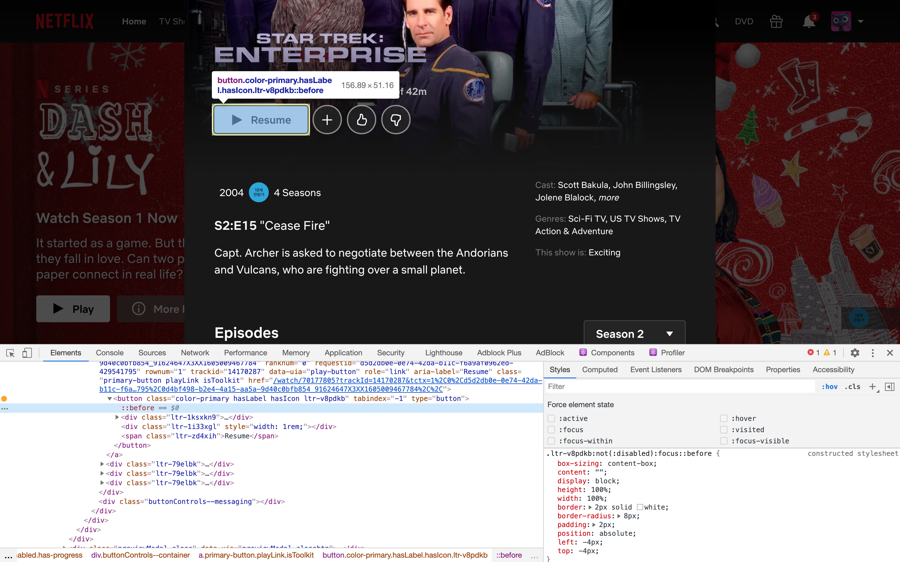
I’ve wondered about what implementing a ring API would look like. For what it’s worth, Netflix uses some trickery with a pseudo element. This benefit of this approach is that |
I know I can add it but I want to understand you vision. Thank you, I will update my currents projects to last alpha 😉 |
|
Migration looks harder when you are using this kind of stuff: EDIT: I think the simple way is to remove tailwind theme and hard code outline. @adamwathan you think there is another solution? |
|
@adamwathan I find a way after looking at your work. If you work with sass and want to allow a components to work with // Sass variable to set the fallback ring color
$component-focus-ring-color: theme('colors.blue.600') !default;
.component:focus {
// Remove outline
outline: none;
// Set tailwind ring custom property (and use sass fallback)
--tw-ring-inset: "";
--tw-ring-offset-width: 0px;
--tw-ring-offset-color: #ffffff;
--tw-ring-color: #{$component-focus-ring-color};
--tw-ring-offset-shadow: var(--tw-ring-inset) 0 0 0 var(--tw-ring-offset-width) var(--tw-ring-offset-color);
--tw-ring-shadow: var(--tw-ring-inset) 0 0 0 calc(1px + var(--tw-ring-offset-width)) var(--tw-ring-color);
box-shadow: var(--ring-offset-shadow), var(--ring-shadow), var(--box-shadow, 0 0 #0000);
}
|

This PR adds a set of new
ringutilities, designed to make it easier to give elements custom focus styles.Here's a quick overview of what they look like in practice:
This will render a custom focus ring (implemented with a box shadow to respect corner radius) with the following visual properties:
It looks like this:
These utilities live inside the following new core plugins:
ringWidth, forring-2ringOffsetWidth, forring-offset-2ringOffsetColor, forring-offset-gray-900ringColor, forring-whiteringOpacity, forring-opacity-50The
ringWidthplugin hasfocusvariants enabled by default, but the rest only haveresponsiveenabled to reduce file size. You only need to add thefocus:prefix to theringWidthutilities anyways.Take a look at the changes to the default config file to get a full picture of what has been added/enabled by default.
Design possibilities
This API is extremely composable and flexible and makes it very easy to create an endless number of custom focus styles without making any changes to your configuration file.
Here are some examples of different styles that are all possible with this API out of the box:
It can also be used to create border effects in situations where you want to add a border that doesn't impact the layout, for example in an avatar group like this:
Detailed implementation notes
Compatible with existing shadows
This is implemented in a way that is fully composable with the existing shadow utilities. Basically this is the CSS we generate (pseudofied to make it easier to understand):
This ensures that if an element has a regular shadow like
shadow-lgapplied to it, it's safe to apply aringutility on top of it without overriding the original shadow.How offsets work
The actual ring shadow width is calculated dynamically by taking the desired width, and adding the width of the desired offset, like this:
How ring opacity works
Ring opacity is implemented the same way border opacity/background opacity/etc. is, using CSS variables:
Default values
If you simply apply the
ringorfocus:ringclasses, you'll get a 3px ring using a semi-transparent blue color, very similar to theshadow-outlineclass. This approach replaces theshadow-outlineclass.Breaking changes
This is a very powerful feature and replaces the need for
shadow-outline,shadow-xs, andshadow-solid, so those have been removed in this PR.Migrating from
shadow-outlinetoringis as trivial as doing a global find and replace sincefocus:ringdoes the same thing asfocus:shadow-outlinedid.I've added
opacity-5andopacity-95so thatshadow-xscan be easily recreated usingring-1 ring-black ring-opacity-5.shadow-solidwas never in a proper Tailwind release (although it is used in Tailwind UI and provided by the @tailwindcss/ui plugin) so that's not a huge deal, but it can also be recreated usingring-2 ring-current