Sound Effects
Outline:
As always, refer to a publisher's style guide for comprehensive information on how to style and place sound effects. This guide is meant to give additional guidance and a broader understanding of the different kinds of sound effect localization.
In localized comics, there are generally three ways that translations can be placed on sound effects:
Some comics also opt to put all of the sound effect translations in a glossary in the back of the book, but there's no point in me talking about that.
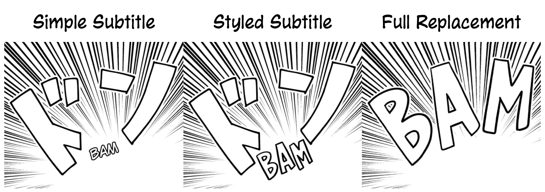
Simple subtitles use a single style of font for every single sound effect, placed just to the side of the original.
Advantages:
- Much faster to letter, as the style doesn't change regardless of the art
- Very minimal obstruction and alteration of the art
- Doesn't take the reader out of the story the way a SFX glossary would
Disadvantages:
- Size and font cannot change with the art, so large SFX might have a comically small subtitle
- Doesn't blend into the art at all
- Less fun to letter
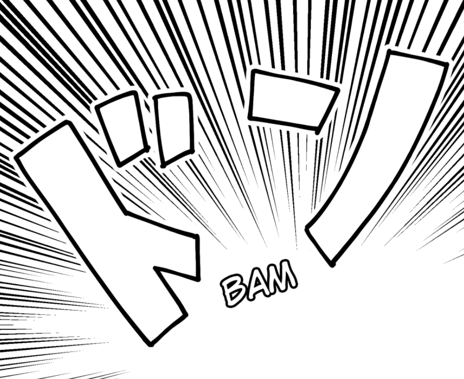
Advantages:
- Changes dynamically with the art, so can blend in pretty well
- No retouching of the art is required
- Lots of room for creativity from letterers
Disadvantages:
- It can be difficult to find fonts that match SFX styling, and drawing SFX by hand is time-consuming
- Fitting translations into the available whitespace makes it hard to read SFX if they're overly styled
- Takes more time compared to simple subtitles
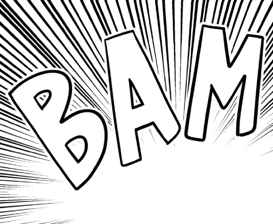
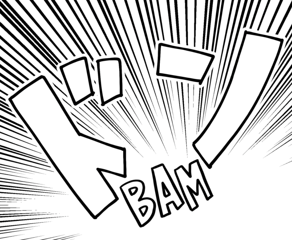
Advantages:
- Most seamless reading experience
- Lots of available space to fit translations, so it should never be difficult for someone to read
Disadvantages:
- Very time intensive
- Very dependent on the letterer's ability to retouch the art convincingly