Skip to content
New issue

Have a question about this project? Sign up for a free GitHub account to open an issue and contact its maintainers and the community.

By clicking “Sign up for GitHub”, you agree to our terms of service and privacy statement. We’ll occasionally send you account related emails.

Already on GitHub? Sign in to your account

is it possible to make VScode's parameter suggestions more readable? #52512

Open
mikemaccana opened this issue Jan 27, 2023 · 10 comments
Open

is it possible to make VScode's parameter suggestions more readable? #52512

mikemaccana opened this issue Jan 27, 2023 · 10 comments
Assignees
Labels
Needs Proposal This issue needs a plan that clarifies the finer details of how it could be implemented. Suggestion An idea for TypeScript

Comments

@mikemaccana
Copy link

This may be a question rather than a feature request (I imagine it's a fairly common problem) but I can't seem to find anything re: configuring this.

Currently VScode shows type hints on very, very wide lines:
enter image description here

It's hard for me to work out what value I am setting or each of the long list of parameters. Instead of:

getOrCreateAssociatedTokenAccount(connection: Connection, payer: Signer, mint: PublicKey, owner: PublicKey, allowOwnerOffCurve?: boolean, commitment?: Commitment, confirmOptions?: ConfirmOptions, programId?: PublicKey, associatedTokenProgramId?: PublicKey): Promise<...>

It would nicer to have something like:

getOrCreateAssociatedTokenAccount(
  connection: Connection, 
  payer: Signer, 
  mint: PublicKey, 
  owner: PublicKey, 
  allowOwnerOffCurve?: boolean, 
  commitment?: Commitment, 
  confirmOptions?: ConfirmOptions, 
  programId?: PublicKey, 
  associatedTokenProgramId?: PublicKey
):  Promise<...>

How can I make VScode's type suggestions more readable? I'm hoping for something I can tweak in IntelliSense settings etc.

@jrieken jrieken assigned mjbvz and unassigned jrieken Jan 27, 2023
@Forlini91
Copy link

Also, it would be great to know something more about that Promise<...> as well (it fits with the request "make it more readable").
Maybe a "click here to show the full type" button which expands those 3 dots?

@mikemaccana
Copy link
Author

mikemaccana commented Jan 28, 2023

Another option would be to combine the top and bottom parameter lists, which would:

  • increase the signal/noise ratio of the popup
  • provide one place that has all the info for each parameter, eg the parameter type, whether it's optional, and the description, rather than spreading this across the top list and bottom list as happens today.

getOrCreateAssociatedTokenAccount() Retrieve the associated token account, or create it if it doesn't exist

@param connection: Connection — Connection to use
@param payer: Signer — Payer of the transaction and initialization fees
@param mint:PublicKey — Mint associated with the account to set or verify
@param owner:PublicKey — Owner of the account to set or verify
@param allowOwnerOffCurve?: boolean — Allow the owner account to be a PDA (Program Derived Address)
@param commitment?: Commitment — Desired level of commitment for querying the state
@param confirmOptions?: ConfirmOptions — Options for confirming the transaction
@param programId?: PublicKey — SPL Token program account
@param associatedTokenProgramId?: PublicKey — SPL Associated Token program account

@return Promise<PublicKey> — Address of the new associated token account

@mjbvz mjbvz transferred this issue from microsoft/vscode Jan 30, 2023
@mjbvz mjbvz removed their assignment Jan 30, 2023
@mikemaccana
Copy link
Author

Another part of the issue is the bottom area doesn't always appear (I think it needs docstrings or similar):

image hence I don't look for it.

If there was just a single readable area, showing parameter, type, and docstring if it exists, that would help me read the parameters quicker.

@RyanCavanaugh RyanCavanaugh added Suggestion An idea for TypeScript Needs Proposal This issue needs a plan that clarifies the finer details of how it could be implemented. labels Feb 4, 2023
@RyanCavanaugh
Copy link
Member

@mjbvz a mini-spec about what should change here would be helpful

@mjbvz mjbvz changed the title is it possible to make VScode's type suggestions more readable? is it possible to make VScode's parameter suggestions more readable? Feb 7, 2023
@mjbvz
Copy link
Contributor

mjbvz commented Feb 7, 2023

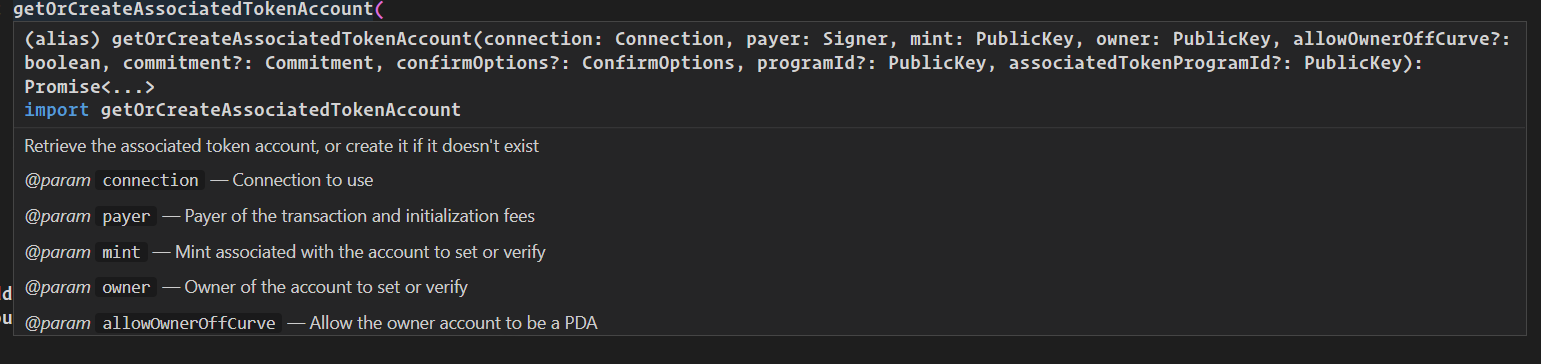
@RyanCavanaugh Not sure. VS Code should already highlight the currently active parameter:

Screenshot 2023-02-07 at 11 12 41 AM

Maybe it would help if we also supported syntax highlighting, like normal hovers do? microsoft/vscode#55044

In the first example though, expanding the types to multiple lines would potentially make it more readable but also push down documentation so that you have to scroll to see it

Maybe this needs some design work on the TS side to figure out what would be most helpful /cc @DanielRosenwasser

@mikemaccana
Copy link
Author

mikemaccana commented Feb 8, 2023

Not sure if you saw my comments / proposal earlier @mjbvz - combining the types and the documentation would make types more readable and save space - there would be less scrolling / vertical space than the current UI requires.

Regarding highlighting currently active parameter that's not happening here in current stable 1.75.0:

image

@mjbvz
Copy link
Contributor

mjbvz commented Feb 8, 2023

@mikemaccana Good ideas but needs more thought. We still need to show the function documentation and docs for the individual parameters may be long, which will then force any additional parameters off screen

Also the active parameter highlighting is specific to the parameter hints / signature help UI. You won't see it in a normal hover like your screenshot shows

@mikemaccana
Copy link
Author

mikemaccana commented Apr 19, 2023

@mjbvz Thanks!

For very long documentation for an individual parameter, we can wrap, have an expandable UI (eg for function parameters), or use ellipses. The current UI has the same issues regarding individual parameters that are very long, with the added clutter of a very long parameter being inlined in the middle of a paragraph about its sibling parameters.

Regarding:

Also the active parameter highlighting is specific to the parameter hints / signature help UI. You won't see it in a normal hover like your screenshot shows

How do I get the parameter hints / signature help UI? All I know is the hover.

@fatcerberus
Copy link

@mikemaccana It’s late but, press ctrl+shift+space while the cursor is inside the argument list.

@chriskuech
Copy link

Similarly there doesn't seem to be a way to navigate through the docs for other matching overloads

Sign up for free to join this conversation on GitHub. Already have an account? Sign in to comment
Labels
Needs Proposal This issue needs a plan that clarifies the finer details of how it could be implemented. Suggestion An idea for TypeScript
Projects
None yet
Development

No branches or pull requests

7 participants