Include the JavaScript file and Stylesheet in your html page. This plugin works with moment.js. There are two methods to include the Material-Datepicker.
Method 1
  <link rel="stylesheet" type="text/css" href="https://rawgit.com/FreddyFY/material-datepicker/master/src/material-datepicker.css">
  <script type="text/javascript" src="http://momentjs.com/downloads/moment-with-locales.min.js"></script>
  <script type="text/javascript" src="https://rawgit.com/FreddyFY/material-datepicker/master/dist/material-datepicker.min.js"></script>
Method 2
  <link rel="stylesheet" type="text/css" href="https://rawgit.com/FreddyFY/material-datepicker/master/dist/material-datepicker.css">
  <script type="text/javascript" src="https://rawgit.com/FreddyFY/material-datepicker/master/dist/material-datepicker-with-moment-js.min.js"></script>
In its simplest case, Material-Picker can be initialised with a single line of Javascript. You will probably also specify some options while applying the plugin.
var monthpicker = new MaterialDatepicker('input');
var monthpicker = new MaterialDatepicker('input', {
  type: 'month',
  lang: 'de',
  orientation: 'portrait'
});-
type (default: "date") [string] - Datepicker["date"], Monthpicker["month"]
-
lang (default: "en") [string] - Language
-
orientation (default: "landscape") [string] - Orientation of the picker: portait or landscape
-
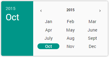
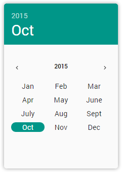
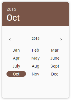
color (default: "#80cbc4") [string] - Color of the picker; Html color values
-
zIndex (default: "100") [number] - z-index of the picker
-
position (default: "absolute") [string] - position of the picker [fixed, static, ..]
-
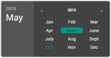
theme (default: "light") [string] - Theme of the picker: light or dark
-
openOn (default: "click") [string] - How to open the picker: Click-events or 'direct'
-
closeAfterClick (default: true) [string] - Close the picker after choose a date or not
-
date (default: today or string inside input) [type: Date Object] - The initial date of the Picker
-
weekBegin (default: "sunday") [string] - Beginning weekday of the week: sunday or monday
-
outputFormat (default: date "YYYY/MM/DD"; month "MMMM YYYY") [string] - Date-format* of the output [inside a input or OutputElement]: Uppercase is a string, Lowercase is a number
-
topHeaderFormat (default: "YYYY") [string] - Date-format* of the output [inside a input or OutputElement]: Uppercase is a string, Lowercase is a number
-
headerFormat (default: date "ddd, MMM D"; month "MMMM") [string] - Date format* in the header bar*
-
sitePickerFormat (default: date "MMMM YYYY"; month "YYYY") [string] - Date format* in the site picker bar*
-
onLoad (default: none) [function] - Function called when picker is loaded
-
onOpen (default: none) [function] - Function called when picker is open
-
onNewDate (default: none) [function] - Function called when new Date is picked
-
outputElement (default: none) [string or Object] - Returns the date inside a SPAN-tag, P-tag or A-Tag
* http://momentjs.com/docs/#/displaying/format/
var monthpicker = new MaterialDatepicker('input', {
  lang: 'de',
  orientation: 'portrait',
  theme: 'dark',
  color: 'red',
  date: new Date(861999834000),
  outputFormat: 'd-mm-yyyy',
  outputElment: '.month',
  onNewDate: function() {
               alert('New Date!!')
             }
});.open()
.close()
.newDate( new Date(861999834000) ) set new Date
.date returns the current date
.element returns the choosen element
.picker returns the picker element