Remove additional side padding from blocks. #9653
Conversation
bf1d0e1 to
27c4e86
Compare
|
This makes me so happy |
27c4e86 to
a72ccfe
Compare
a72ccfe to
b0db890
Compare
|
Rebased, tested. This seems solid. |
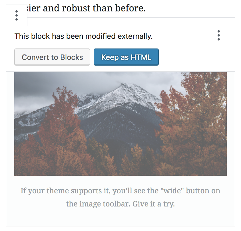
You may have noticed that the padding left and right on a block is wider than above and below.

This was done in effort to make it simple to select the parent block by simply hovering it with the mouse. Arrow keys already traverse up to parent blocks and there's a clickthrough effect on mobile.

However in practice this additional padding has not felt sufficient, and was at the cost of some visual complexity. Instead, we'll be looking at improving parent child selection in #9628.

This PR thus reverts the style of this to how it used to be, with the same padding all around a block.

Reminder: this padding is purely visual — through negative margins, it doesn't actually affect the width of the block itself, or the margins above and below. See also #8350.
b0db890 to
e3f460e
Compare
This has been removed separately, this is just a cleanup job.
|
Tested yet again, rebased, and did a quick cleanup job to remove references to ellipsis on the side. Let's get this in. On a sidenote, in testing this, I did a lot of testing on the columns block. This is sort of the notorious "it's hard to select the parent block" example. This remains the case. However, it is SO VERY VERY EASY to just use the arrow keys to select the parent. For example, select the column, then press up. This selects the parent. This is part of the cross-block arrow-key navigation, and it's been working for a while. I'm not suggesting this arrow key navigation is sufficient, but I do think this speaks to the breadcrumbs and clickthrough as proposed in #9628 as being correct steps forward, as those features simply surface that feature more clearly. |
|
Hey @jasmussen - I've been giving this a test this morning. It looks really good. I've found this one issue so far, the warning here is too high:
|
|
Excellent catch, thank you! That appears to have been the result of a bad rebase. In any case, it's fixed now. In master:
This branch:
|


|
@jasmussen One more tiny one 😄 I noticed this with the reusable block icon in the top right of the block and some blocks that have a solid background (images, embeds, etc.): Feels like maybe the icon should sit over the top of the image? |

|
Great catch. Fixed it. Note that I had to add a z index both to the indicator, and I had to elevate the z index of the hover breadcrumb as well. But I didn't see any negative side effects of doing this.
|

There was a problem hiding this comment.
This looks good to me. I've done a fair bit of testing in Chrome, IE11, and Edge. I could only spot the issues I mentioned.
It's nice that this includes quite a bit of removal of styles as well - yay! 🎉
Not sure if you also need a design approval as well, or maybe that's already happened in discussion elsewhere.
|
This crosses off one of my biggest tiny annoyances, thanks! |
|
😅🎉 |
|
Very excited to see all the red in this diff and happy to see this land! |
You may have noticed that the padding left and right on a block is wider than above and below.
This was done in effort to make it simple to select the parent block by simply hovering it with the mouse. Arrow keys already traverse up to parent blocks and there's a clickthrough effect on mobile.
However in practice this additional padding has not felt sufficient, and was at the cost of some visual complexity. Instead, we'll be looking at improving parent child selection in #9628.
This PR thus reverts the style of this to how it used to be, with the same padding all around a block.
Reminder: this padding is purely visual — through negative margins, it doesn't actually affect the width of the block itself, or the margins above and below. See also #8350.
Before:
After:
Note that this PR touches a rather big CSS file that right now has a bunch of vestigial stuff related to the ellipsis menu on the right, as well as draggable areas left and right of the block. Notably as the incoming improvements to the drag handle are merged, this PR will probably need to be carefully rebased. CC: @nosolosw @youknowriad