Try a simpler spacing setup for gallery items #10027
Conversation
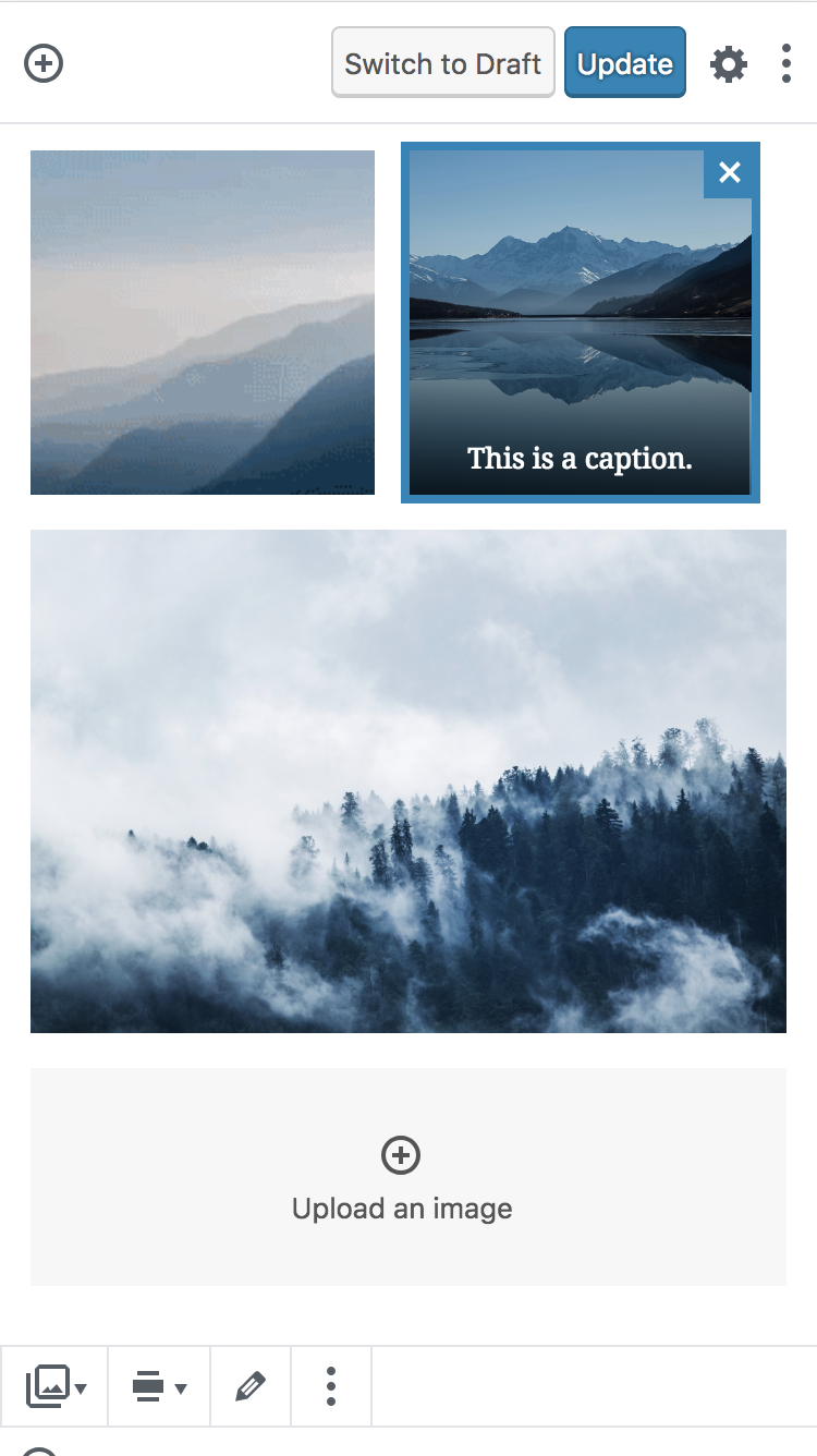
The stock gallery features white gutters between items. Currently in `master`, every item has an even 8px margin all around. We then compensate for this, left and right, of the gallery, to make sure items in the gallery align correctly with text width above and below the gallery.

This PR attempts a different approach. It sets only the right and bottom margin on gallery items, and then unsets the right margin on the rightmost item in each row.

This is a little more complex in the rules that are output, but it solves the issue presented here: #9670 (comment)

Let me know your thoughts.
|
It solves my problem in the preview mode, no horizontal scroll anymore 👍 |
|
@kjellr I could use your CSS sanity check on this one. Thanks. |
There was a problem hiding this comment.
It looks like a lot of the CSS here needs to be removed rather than commented, but I tested things in IE 11 and they seemed okay.

I couldn't reproduce the alignundefined class, but that seems a separate issue anyway… if you can reproduce it consistently please do file a bug and I'll take a look, it'd think the fix would be straightforward.
| // Allow gallery items to go edge to edge. | ||
| .gutenberg .wp-block-gallery:not(.components-placeholder) { | ||
| /*.gutenberg .wp-block-gallery:not(.components-placeholder) { |
There was a problem hiding this comment.
This should be removed, right?
There was a problem hiding this comment.
🤦♂️ right yes thanks.
| } | ||
| } | ||
| } | ||
|
|
||
| // Unset right margins. | ||
| @for $j from 1 through 8 { |
There was a problem hiding this comment.
The other for loop starts at 3 because 1 and 2 have their own explicit rules for mobile, and 3 columns and up is for above mobile breakpoints anyway.
But the rules to remove the right margin on the rightmost tile applies across the spectrum, i.e. from 1 up to and including 8 columns.
There was a problem hiding this comment.
Might be good to add a comment then, stating that 8 columns is the max or something because that wasn't clear to me 😄
|
Thanks for the IE sanity check 💕 |
Completely agree that's separate. I can reproduce it consistently though, it's only in the editor, and it appears to be benign, so it's not saved for the post itself:
|

Remove debug comments. Sorry, long day.

Clarify comments.
| } | ||
|
|
||
| &.columns-1 .blocks-gallery-image, | ||
| &.columns-1 .blocks-gallery-item { | ||
| width: calc(100% / 1 - 16px); | ||
| width: calc(100% / 1); |
There was a problem hiding this comment.
Is calc(100% / 1) the same as 100%?
There was a problem hiding this comment.
Yes, I think it was written this way to mimic the other column math in near context... sort of like when we use $border-width instead of 1px just to make the math more easily digestible.
I'm fine with changing this if you like?
There was a problem hiding this comment.
Ok, I thought it was either that or some kind of CSS hack. It's probably best to change it, but it's very very minor 😄
| @include break-small { | ||
| @for $i from 3 through 8 { | ||
| &.columns-#{ $i } .blocks-gallery-image, | ||
| &.columns-#{ $i } .blocks-gallery-item { | ||
| width: calc(100% / #{ $i } - 16px); | ||
| width: calc((100% / #{ $i }) - (#{ $grid-size-large } * #{ $i })); |
There was a problem hiding this comment.
I had a test, and the items are too small at column sizes 4 and above. When I choose 4 columns I actually end up with 7 items in a row.
This calculation doesn't seem right. For every item we subtract margin * columnCount. However, each item only has a static unchanging margin of $grid-size-large. The margin doesn't increase for an individual item when there are more columns. Changing the line to this fixes things:
width: calc((100% / #{ $i }) - #{ $grid-size-large });
The same applies for the other calculations, it works fine without $grid-size-large being multiplied.
There was a problem hiding this comment.

| } | ||
| } | ||
| } | ||
|
|
||
| // Unset the right margin on every rightmost gallery item to ensure center balance. | ||
| @for $j from 1 through 8 { |
There was a problem hiding this comment.
I think even though this is scss, I still prefer giving variables a proper name like $column-count. As far as I know, sass has block scope, so it shouldn't cause an issue.
| .blocks-gallery-image, | ||
| .blocks-gallery-item { | ||
| margin: 8px; | ||
| // Add space between thumbnails, and unset right most thumbnails later. | ||
| margin: 0 $grid-size-large $grid-size-large 0; |
There was a problem hiding this comment.
I think we could take advantage of aliasing $grid-size-large to make things more readable. Maybe something like $item-margin.
There was a problem hiding this comment.
I would like to address/discuss this separately. We already have an $item-spacing variable of 10px that I'd like to retire in favor of a grid unit. But the overall idea is to introduce a visual grid to all of Gutenberg that should make things align better — so I would prefer we can keep the term "grid" as part of it.
|
I'm definitely in favour of this approach, I think trying to only apply margin to the bottom and/or right is a constraint that results in cleaner css. 👍 |
|
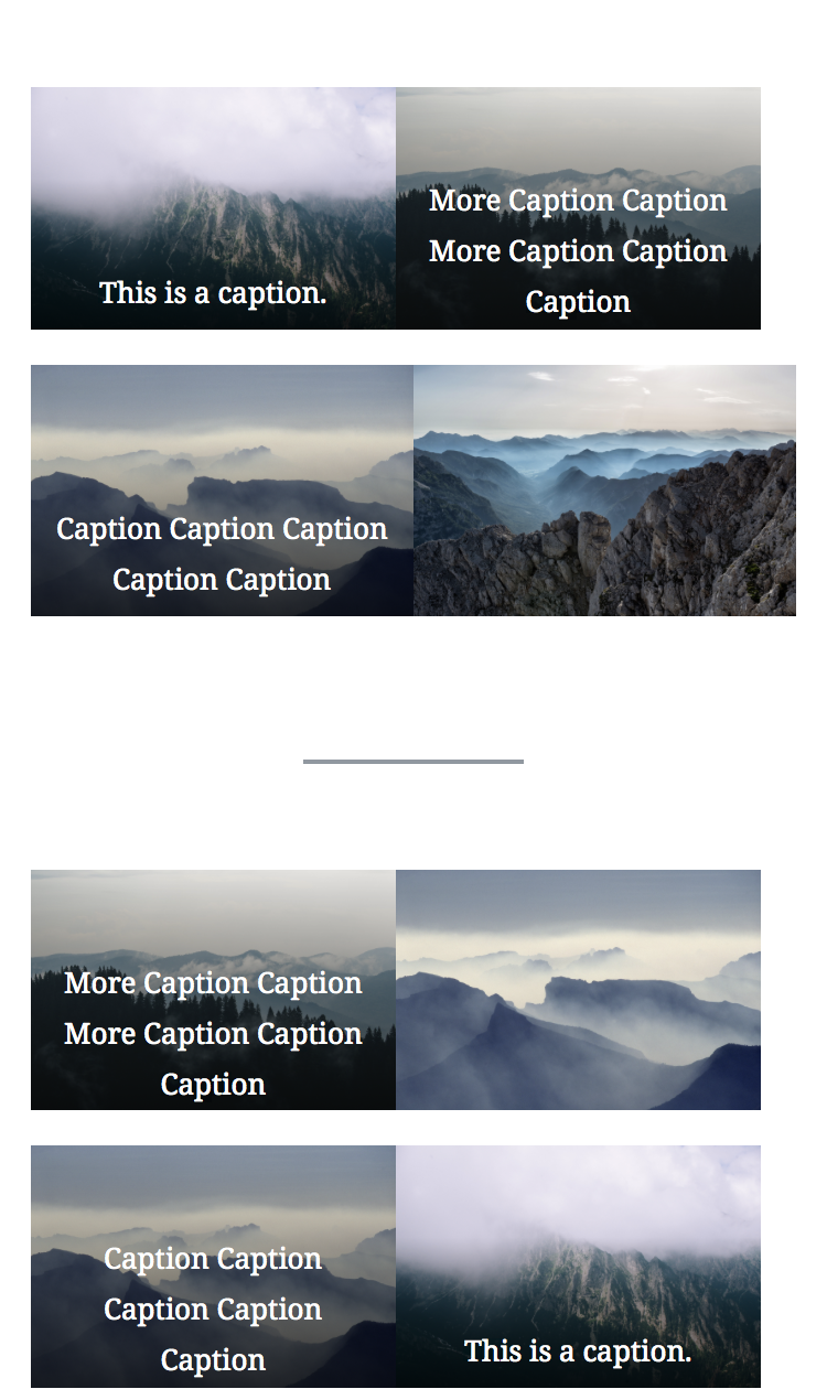
I like this approach too. Just a couple issues I've noticed during testing: I'm seeing spacing issues with galleries that have 5 or more items in 4 or more rows (These persist on the front end too, and sound like they're related to @talldan's comment above):
When things drop to two columns on mobile, it looks like every second row's right margin is missing:
|


|
Guys, it was just a mathematical question. First subtract the margins total, then divide by the number of columns.
|

|
Thank you @SofiaSousa you were right there was something off with the math. But I believe I've fixed it now!
|

|
Yep, I've tried with chrome, safari, and firefox and it looks correct, thanks 👍 |
|
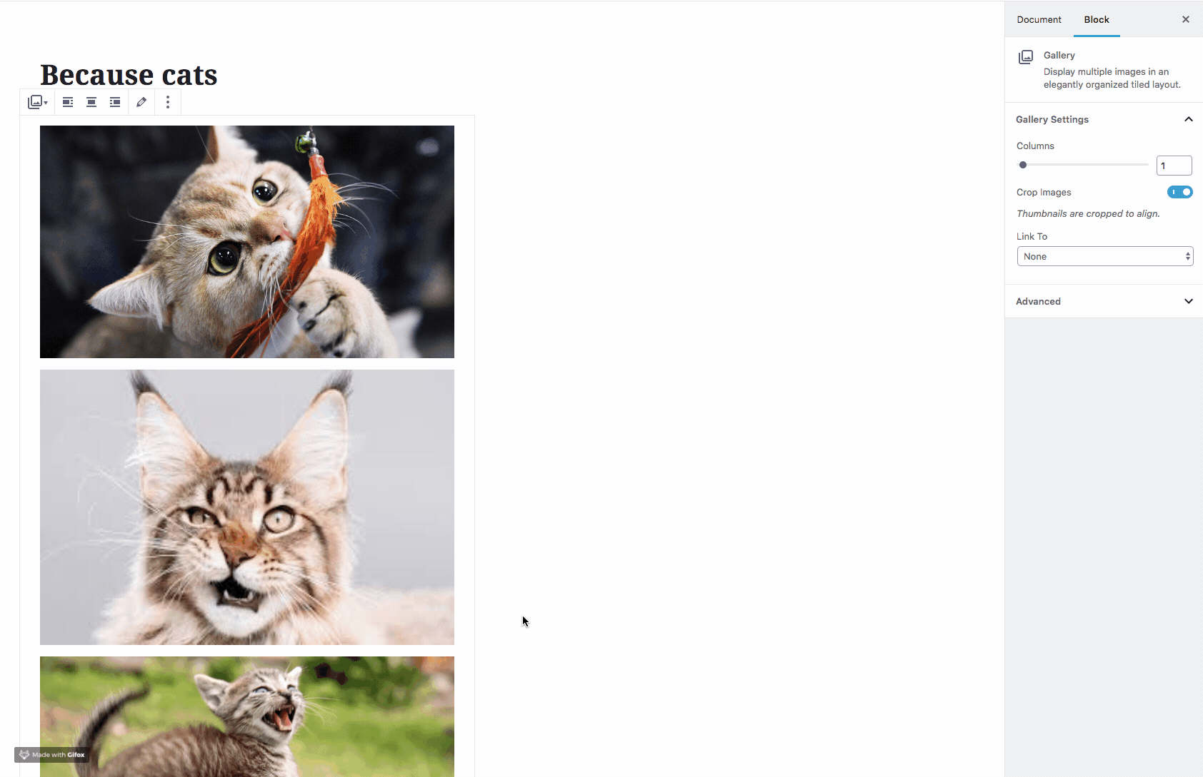
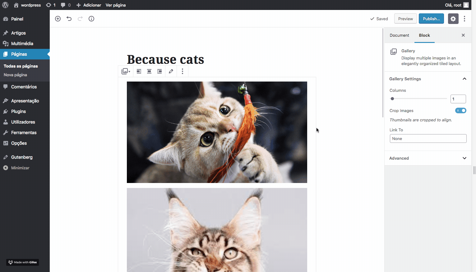
This is working great on large screens! 💯 (Please ignore this if you're already aware, but) I'm still seeing issues at mobile breakpoints. For example, this is a 3-col gallery with 4 items, as seen on a small screen:
|

|
It looks like the margin reset is still being applied to every nth item for the mobile fallback. That's a bit of a tricky one to solve. |
|
Still think math is not totally correct:
is not the same of
With a practical example, assuming 100% is 580px: Now, the columns width only looks right because of the The width of a column is the total width less the total of margin between columns divide by the number of columns. When colunms = 2 When colunms = 3 So my solution would be something like this:
|


…at mobile breakpoints

Co-authored-by: Sofia Sousa <[email protected]>
|
@SofiaSousa Thanks! that works well for me. I've pushed the CSS from your comment in a commit. @kjellr - are you able to retest? I had a quick test and couldn't spot any issues. |
Looks good in Gutenberg!
I think that latest update needs to get pushed to the font-end styles too though:
|

|
Hmm @kjellr I'm not seeing that issue on the front-end. Which theme is this? Also the rules should be output on the frontend since they're in style.scss. Cache issue? Otherwise let me know how to reproduce. Thanks for testing. |
|
Also looks good to me in the front-end 👍 |
|
Very odd! I'm still seeing the error. It doesn't seem like a caching bug, since it's happening in every browser I try — even after changing themes and creating brand new galleries. Here's what I'm doing:
Those screenshots are in Safari 12.0 (using the Twenty Seventeen theme), but I'm seeing the same in Chrome + FF, too. 🤔 |
|
I still can't reproduce. Tried Safari, tried Twenty Seventeen. This is so weird. Try this: It's sort of a nuclear way to delete the branch, pull it fresh and try it again. My only thought is you have some cache ghost or an old version of the branch. |
|
I have
This is chrome but the same happens on safari or firefox. And it happens because of this rule: |


Props @SofiaSousa
|
You were right! I could reproduce it with a gallery of 2 items, and removing that rule fixed it. Thank you! |
|
I'm sorry guy, but you can't simply remove that rule, it's needed for mobile.
|
Haha, sorry — It seemed to work for me in mobile in quick testing, but I've now tested with additional configurations and breakpoints. Added your revised rule. Thank you. Good for final round of testing? |
|
Well, it's looking nice in safari, firefox and chrome for me, but more people should test, just in case :) |
|
Nice work here all, it was fun reading the history :) |
#10027 introduced a small bug where the last item in a gallery jumps around when a user is in the process of adding a caption.

This is due to a `:nth-last-child(2)` style rule that is applied to a gallery when it has an `is-selected` class, but not an `is-typing` class.

This PR modifies that rule to include the `is-typing` class and remove the jump.
The stock gallery features white gutters between items. Currently in
master, every item has an even 8px margin all around. We then compensate for this, left and right, of the gallery, to make sure items in the gallery align correctly with text width above and below the gallery.This PR attempts a different approach. It sets only the right and bottom margin on gallery items, and then unsets the right margin on the rightmost item in each row.
This is a little more complex in the rules that are output, but it solves the issue presented here: #9670 (comment)
Let me know your thoughts. The columns markup itself is a little more complex, but the gallery itself is easier to style for themes, as it no longer uses negative margins.
If we like this, we'll need to test for IE as well.
By the way I noticed this:
It looks like when the gallery block has no alignment, an "alignundefined" is applied.
CC: @SofiaSousa