2. Components
- Window
- Button
- ToggleButton
- PathButton
- IconButton
- Field
- CheckBox
- ComboBox
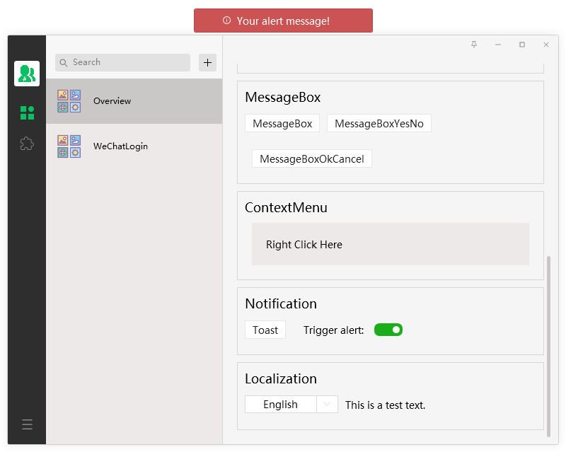
- MessageBox
- ContextMenu
- Toast
- Alert
顶部系统按钮及默认使能情况(Top system buttons and default enable status):
- 设置按钮(SettingsButton):IsSettingsBtnEnable=False
- 置顶按钮(TopmostButton):IsTopmostBtnEnable=False
- 最小化按钮(MinimizeButton):IsMinBtnEnable=True
- 最大化按钮(Maximize Button):IsMaxBtnEnable=True
- 关闭按钮(Close Button):IsCloseBtnEnable=True
Title:
- TitleAlign: Left | Center(default)
- TitleColor
- TitleFontSize
- TitleMargin
<Button>Default Button</Button>
<!-- xmlns:weui="https://github.com/IUpdatable/WeUiSharp" -->
<!-- default: GreenType=None -->
<weui:Button>Button</weui:Button>
<weui:Button GreenType="All">Full Green Button</weui:Button>
<weui:Button GreenType="Foreground">Foreground Green Button</weui:Button>
<weui:Button GreenType="Hover">Hover Green Button</weui:Button>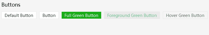
<ToggleButton IsChecked="True" />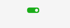
<!-- xmlns:weui="https://github.com/IUpdatable/WeUiSharp" -->
<weui:PathButton ToolTip="This is PathButton" Width="25" Height="25" Background="Transparent"
                MouseOverForeground="{StaticResource WeUiGreen}">
    <weui:PathButton.Path>
        <Path Data="{StaticResource WeUiGeometry_AddFriend}"/>
    </weui:PathButton.Path>
</weui:PathButton>
Background和Foreground都分别有三种状态的颜色属性(Both Background and Foreground have three-state color attributes respectively):
-
Background:DefaultBackgroundMouseOverBackgroundPressedBackground -
Foreground:DefaultForegroundMouseOverForegroundPressedForeground
DefaultBackground VS Background:
如果你只想要一种背景颜色,那么直接使用Background,无需再设置MouseOverBackground和PressedBackground。如果希望保留三种状态下的颜色,那么请使用DefaultBackground。DefaultForeground和DefaultForeground与之同理。(If you only want one background color, then use Background directly without setting MouseOverBackground and PressedBackground. If you want to keep the button colors in the three states, then please use DefaultBackground. The same goes for DefaultForeground and DefaultForeground.)
<!-- xmlns:weui="https://github.com/IUpdatable/WeUiSharp" -->
<weui:IconButton ToolTip="This is IconButton" Width="25" Height="25" StaticIcon="../Resources/Chat.png"
    MouseOverIcon="../Resources/Chat_MouseOver.png" PressedIcon="../Resources/Chat_Pressed.png"/>
<!-- xmlns:weui="https://github.com/IUpdatable/WeUiSharp" -->
<weui:Field Width="150">Default Field</weui:Field>
<weui:Field PlaceHolder="This is Placeholder" Width="150"></weui:Field>
<weui:Field IsPassword="True" PlaceHolder="Enter password" Width="150"></weui:Field>
<weui:Field IsPassword="True" Password="123456" Width="150"></weui:Field>
<CheckBox>Option0</CheckBox>
<CheckBox IsChecked="True">Option1</CheckBox>
<CheckBox>Option2</CheckBox>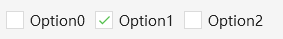
<ComboBox Height="30" Width="120" >
    <ComboBoxItem>Option1</ComboBoxItem>
    <ComboBoxItem  IsSelected="True">Option2</ComboBoxItem>
    <ComboBoxItem>Option3</ComboBoxItem>
</ComboBox>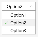
MessageBoxResult dialogResult = MessageBox.Show("This is a MessageBox!", "Title", MessageBoxButton.YesNo);
if (dialogResult == MessageBoxResult.Yes)
{
    MessageBox.Show("You clicked Yes");
}
else if (dialogResult == MessageBoxResult.No)
{
    MessageBox.Show("You clicked No");
}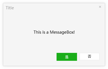
- 因为
WeUiSharp是支持多语言动态切换的,所有MessageBox中按钮的文字是跟随系统设定的。(BecauseWeUiSharpsupports multi-language dynamic switching, the text of all the buttons in theMessageBoxfollow the system settings.)
MessageBoxResult MessageBox.Show(string messageBoxText);
MessageBoxResult MessageBox.Show(string messageBoxText, string caption);
MessageBoxResult MessageBox.Show(string messageBoxText, string caption, MessageBoxButton button);MessageBoxButton:
- OK (default)
- OKCancel
- YesNoCancel
- YesNo
- GotIt
MessageBoxResult:
- None
- OK
- Cancel
- Yes
- No
- GotIt
- 方式一(Method one)
xaml
<XXX.ContextMenu>
    <ContextMenu ItemsSource="{Binding MenuItems}"/>
</XXX.ContextMenu>
code
public class OverviewViewModel : BindableBase
{
private List<MenuItem> _MenuItems;
private ICommand _MenuItemCommand;
public List<MenuItem> MenuItems { get => _MenuItems; }
public OverviewViewModel()
{
InitContextMenu();
}
private void OnClickMenuItem(object obj)
{
if (obj is MenuItem menuItem)
{
MessageBox.Show("You clicked " + menuItem.Header, "ContextMenu");
}
}
private void InitContextMenu()
{
_MenuItemCommand = new DelegateCommand<object>(OnClickMenuItem);
_MenuItems = new List<MenuItem>();
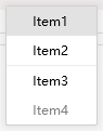
var menuItem1 = new MenuItem()
{
Header = "Item1",
Command = _MenuItemCommand
};
menuItem1.CommandParameter = menuItem1;
var menuItem2 = new MenuItem()
{
Header = "Item2",
Command = _MenuItemCommand
};
menuItem2.CommandParameter = menuItem2;
var menuItem3 = new MenuItem()
{
Header = "Item3",
Command = _MenuItemCommand
};
menuItem3.CommandParameter = menuItem3;
var menuItem4 = new MenuItem()
{
Header = "Item4",
IsEnabled = false,
Command = _MenuItemCommand
};
menuItem4.CommandParameter = menuItem4;
_MenuItems.Add(menuItem1);
_MenuItems.Add(menuItem2);
_MenuItems.Add(null); // 分割线 MenuItemSeparator
_MenuItems.Add(menuItem3);
_MenuItems.Add(menuItem4);
}
}
// Toast.Show(string message, double durationSec = 3.5)
Toast.Show("Tis is a Toast!", 1);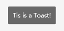
- 使用
Alert的前提是Window下的根元素必须为Grid。(The premise of usingAlertis that the root element underWindowmust beGrid.) - 报警提示信息会一直位于窗体顶部居中位置。(The alert message will always be located at the top center of the window.)
// 触发一个报警(Trigger an alert)
(System.Windows.Application.Current.MainWindow as WeUiSharp.Windows.Window).TriggerAlertCommand.Execute("Your alert message!");

// 取消报警(cancel an alert)
var window = System.Windows.Application.Current.MainWindow as WeUiSharp.Windows.Window;
if (window.IsAlertTriggered)
{
    window.CancelAlertCommand.Execute(null);
}