In the scheme of Identity Design, the mark tells the world, in an instant, who you are. In the case of the Western Region, the mark must serve both as a standalone identity and part of a greater community of graphics - The Order of the Arrow, and Boy Scouts of America, and accompanying OA regions representing South, Central, and Northeast USA.
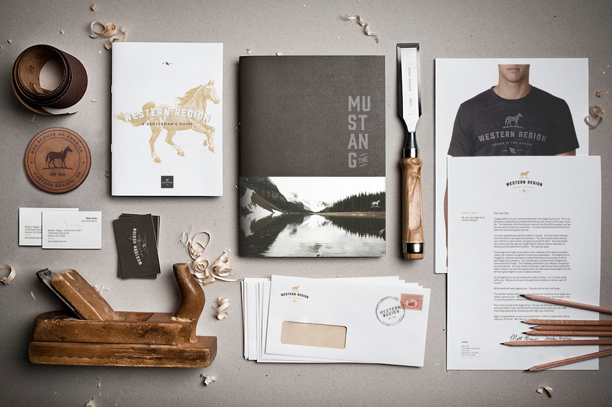
The mark’s strength is in its position as a quasi- crest. Each element by itself is straightforward: a horse, text, and the OA arrowhead. Together, the composition takes on a traditional, familliar, almost hipster presence which can be easily rearranged in horizontal or square con gurations among thousands of others.
The crest adopts the visual language of contemporary artists and photographers - drawing on classic cues to create a feeling of nostalgia while keeping a clean, modern aesthetic. This logo communicates a club-like bond within the Western Region community and leans away from foreign innovations.
The handmade horse graphic attains personal identity in its use of negative space, featured on page 7. By carefully integrating the geologic area of the Western Region into the mark, there is a greater attraction to its implementation and use.