- SWBAT describe bad and good visual design with respect to organization, readability, font size, and accents like color, fonts, and images.
- SWBAT make the most important information the easiest to find.
- SWBAT articulate their design preferences and priorities using vocabulary like readability, negative space, hierarchy, contrast, consistency.
- SWBAT write basic CSS rulesets that accomplish their design end goals, including modifying text size, line height, margin, padding, color, and background color.
Frame that we're about to teach color, fonts, formatting, and all the other pieces of web design that students have been hungry for, but remind them that with great power comes great responsibility. You will grant them these superpowers only on the condition that they use them to make the web better - not worse.
Challenge students to go on a web scavenger hunt to find the ugliest and most beautiful websites on the internet. Allocate about 5 minutes for this. Then allocate another 10 minutes to demo and debrief findings whole class (5 minutes for ugly, 5 minutes for beautiful).
Bad design is usually characterized by some of the following:
- Abrasive Colors
- Disorganization
- Too much text, usually without clear headers and subheaders
- Very little negative space - students will describe this type of site as "busy"
In contrast, good design has the following goals:
- To make the most important information the easiest to find.
- To answer your questions in the order you're likely to have them.
- To place more specific information exactly where you'd expect it.
- To make sure you can focus on one thing at a time without being distracted by other information or content.
- To use colors, fonts, and layout to help you focus (not to distract).
Therefore, good design is usually characterized by the following:
- Large text, widely spaced, and condensed down to the most important information. You almost always have to click to learn more.
- Lots of negative space (areas with no content) to direct your focus onto what little is there.
- Pro-tip that the "padding" property is one of the best ways to achieve this.
- Clear design hierarchy (the most important info is up top, in large fonts; more specific info is in smaller fonts, and usually further down)
- Consistency across similar elements.
- Intentional, simplistic font choices. Even though it's tempting to use really bubbly, playful, or decorative fonts, most of the best and most beautiful websites use only two fonts: one for headers, another for body text, and the vast majority of websites use thin and block versions of sans-serif fonts.
A lot of these ideas are laid out with accompanying visuals on the Material Design homepage. Encourage any student who is struggling to understand to go back and see the examples there.
Try each of the following:
Sets the color of the text. There are several ways to do this.
CSS pre-defined color words:
h1 {
  color: teal;
}
Hexadecimal (Hex) numbers:
h2 {
  color: #B2DFDB;
}
RGB colors:
h3 {
  color: rgb(128,203,196);
}- The pre-defined names are almost all abrasive and difficult to look at. Pick your own (gentler) colors instead.
- Colored text rarely works as intended in web design. The three best colors you can use are white (on dark backgrounds), black (on light backgrounds), and some gentler shades of grey.
- If you are going to use colored text, restrict that to very purposeful and specific uses, like buttons or headers.
Sets the color of the background of the element selected. Responds to all the same values as the color property.
Using pre-defined names:
h1 {
  background-color: teal;
}
Using RGBA values (where a, alpha, represents how opaque or transparent a color is):
div {
  background-color: rgba(0,0,0,0.2);
  /* The actual color is black (0 red, 0 green, 0 blue), but since it's only 20% opaque (and therefore 80% transparent), the color will render as a grey, and any color behind it will shine through.  */
}- As before, the pre-defined names are pretty terrible as background colors. Pick your own gentler colors instead.
- When picking colors, you usually need less saturation / vibrancy than you think. It's easier to make mistakes that make websites uglier when you're using bright, neon, or bold colors.
- Limit the color accents to 1-3 colors. Less is absolutely more.
- Use background on parent elements (like a div used to group text) to make it clear that the child elements are all part of the same whole.
The property for setting fonts is font-family.
Many fonts will be built into a browser, and you can simply use them straightaway.
h1 {
  font-family: "helvetica";
}
Use fallback values if you're not sure whether your users will have a certain font available.
h1 {
  font-family: "Gill Sans", sans-serif;
  /* This means try to use Gill Sans, but if you can't find that, then just use the default sans-serif font.  */
}/* load in the font from google fonts at the top of the stylesheet */
@import url('https://fonts.googleapis.com/css?family=Economica');
li {
font-family: 'Economica', sans-serif;
/* Use the font (with a fallback) in the elements you want to style. */
}li {
font-size: 40px;
}h1 {
font-size: 3rem;
/* This means 3x as big as normal */
}Determines how bold (or not) text is. Can take any multiple of 100 (thinnest) up to 900 (boldest).
li {
  font-weight: 900;
}
NOTE: Not all fonts have all 9 versions available, so most browsers will just choose the nearest equivalent.
Determines how tall each line of text is (to simulate double, single, or multi-line spacing).
- You will be most drawn to decorative and cursive fonts, but they often impede readability. Notice that Apple, Spotify, Google, and Amazon all avoid using any of the cursive or pseudo-cursive fonts on their pages - they opt for crisp, clean, sans-serif fonts instead.
- Make fonts larger than you might think they need to be. This helps with readability (and keeps your pages from looking too busy).
- Use font size to signal how important content is - huge text will always be read first.
- Adding line height makes text easier to read, so apply additional line height to anything over a sentence long.
- Use font weight to contrast thick titles with think subtitles or body text to have a striking effect while still only using one font.
Whitespace (which is not necessarily white) refers to the spacing between elements. Almost all well-designed websites have tons of it, which is how they direct your attention to the desired items.
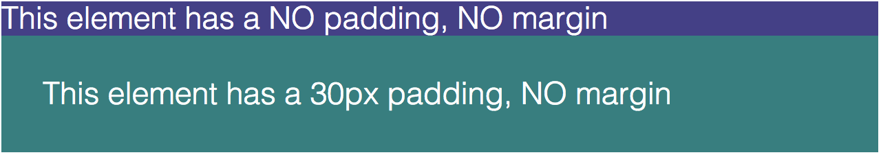
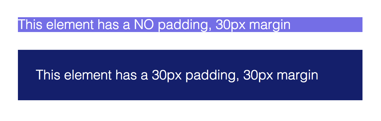
CSS padding is space between the edge of the element and the content inside, whereas margin is the space between separate elements. Here's what that looks like:
Here's the syntax to declare padding:
h1 {
  padding-top: 20px;
  /* Only pads the top of the element. */
}

li {
  padding: 5px;
  /* Pads all four sides of the element. */
}CSS margin is the space between separate elements. Here's an example of how padding and margin interact.
Here's the syntax to declare margin:
h1 {
  margin: 15px;
  /* Adds margin to all four sides of the element. */
}

li {
  margin-left: 30px;
  /* Only adds margin on the left side of the element. */
}- If an element has a background color (or border), it will almost always need padding too - otherwise the content will appear cramped and the element itself will seem small.
- If there is no background color, almost every element will need margins of some size added to keep it from appearing too close to its neighbors.
- When in doubt, err on the side of adding too much whitespace - it's almost never too much.
Use the text-shadow property to add a shadow to the text on a page.
Use four values: text-shadow: offsetX offsetY blur color;
To get a crisp shadow, use 0 for the blur value.
h1 {
  text-shadow: 2px 2px 0px black;
}Use the box-shadow property to add a shadow to the entire rectangular area of an element.
Use four values: box-shadow: offsetX offsetY blur color;
To get a crisp shadow, use 0 for the blur value.
h2 {
  box-shadow: 10px 10px 0px rgba(0,0,0,0.3);
}- Text shadow is really only useful when there isn't enough contrast between text and its background, and shadow makes it more readable.
- In these cases the smarter fix is often to change the color of the text or the background instead.
- Box shadow is used when trying to make digital items resemble real items (like cards or paper) from the material world, because it simulates depth. Only use box shadow if it's important that an item appear to be hovering above its neighbors.
- Google, which generally adheres to Material Design principles, makes use of box shadow all the time.
- Apple and Spotify edge-to-edge flat design, so their content is less likely to use box shadow.
Remember to gather student feedback on this lesson. In addition to the standard close, consider priming students for feedback with the following questions.
- Does good design depend more on your HTML, or more on your CSS? (Answer: both play a critical role. The less organized your HTML is, the more difficult it will be to style it in CSS)
- We've seen that the most well-designed websites don't have a lot of text on their main pages. When you have to cut text from your main page, how will you decide what to cut?
- One of the principles we've seen applied with some success is having only one main thing on screen at a time, so your user doesn't have to divide their focus. What css property / properties will be most helpful in making sure this happens?