Improve line extension #15
Comments
|
An alternative worth exploring is the idea of scanning the two paths for matching commands and then ensuring that matches end up in the same position when expanded so they do not move. |
|
Example where this could be helpful: https://twitter.com/Elijah_Meeks/status/913150506205249536 |
|
Maybe irrelevant and completely out of scope here but easier than adding it to a tweet chain: domain specific things, or even just projection specific things have a big impact on what's a desirable transition and what's an odd one. For example, the top image is assumed to be either a time series, or at least something where one dimension strictly monotonically changes (as the line depicts a continuous function). Making it grow out of a single point is not truthful in that, during the transition, the 'time' values of the points aren't right, even if, at the end of the transition, they become right:
The same is true with the Y (dependent) values, making them grow out of whatever the last value was is arbitrary, but it's not as disturbing as the shifting time (X) points. In this case, a better alternative might be a fading-in of the incrementally added piece of curve, in place. The fading in could be done via color/opacity or line thickness. Heterogeneous line widths or even colors are not easy with SVG but they're possible (thickness: segmenting, and perhaps adding extra control points if it's a spline so that the overall shape looks OK; color: same, or Another, less truthful approach that at least doesn't shift points in time, would be a two-phase transition: A. extension (growth, fade-in or stroke width) of a horizontal line to the right from the current point; B. vertical transition of the points. In this case, phase A could use a dashed, blurred or faded line, so that the viewer is not for one moment lead to believe that the current value actually extends into the future. So it'd look a bit more like an animated annotation that goes away once it's not needed. The more we know about the data, the better transforms are possible (going against the idea of a general transformer though). For example, if the future can be depicted as some ever-widening gaussian distribution, then a single line can be extended into the future as eg. a greyscale distribution with perhaps the mean or some quantiles indicated as lines:
Adding a new measured point of course 'collapses' the band to a single line section, can be nicely transitioned (narrowing the distribution of subsequent periods - maybe simultaneously, because we've learned a new piece of data that immediately updates our future belief). There can be alternatives, e.g. representing the future as some Monte Carlo simulation:
or, if the future is forecast by analysts, then individual curves for these, such as
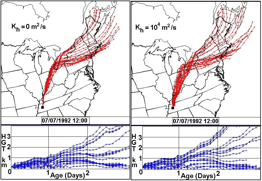
These were time series of a single observable, but it generalizes to 2D cases as in realized vs predicted hurricane paths:
The above examples go after the question of what info we have for the future before we get there, and it may or may not be useful for a specific project. Often,
These are just examples and it just scratches the surface, only showing that there's not enough info encoded in a pair of |
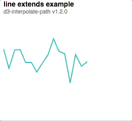


v1.1.1 handled extending lines fairly well since it was based on

xposition.In the latest version, we are equally distributing where segments get split, so the extending doesn't work as well.

Perhaps an option can be added to still split segments based on distance?
The text was updated successfully, but these errors were encountered: