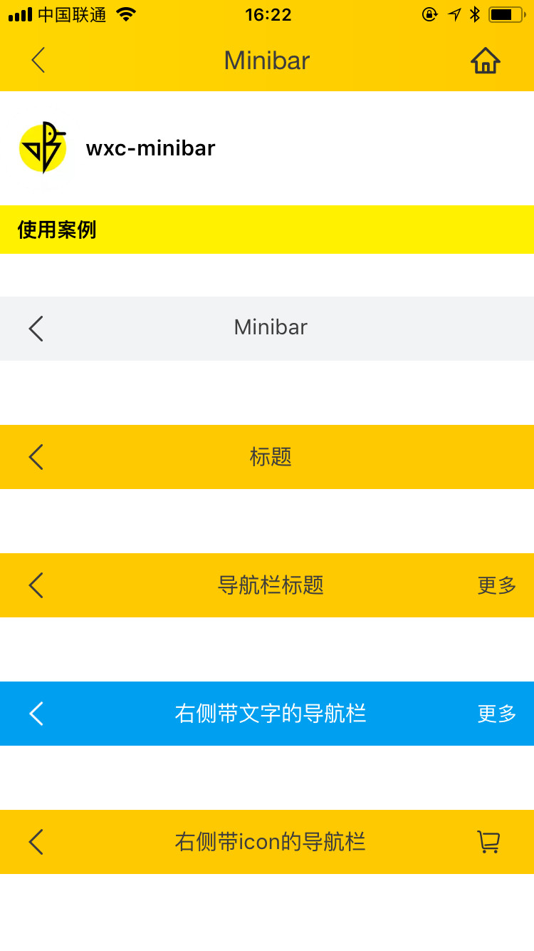
Title Bar
- Use the Native Navigator Bar
first.
<template>
  <div class="container" :style="{ height: height }">
    <div class="demo">
      <wxc-minibar title="title"
                   background-color="#009ff0"
                   text-color="#FFFFFF"
                   right-text="more"
                   @wxcMinibarLeftButtonClicked="minibarLeftButtonClick"
                   @wxcMinibarRightButtonClicked="minibarRightButtonClick"></wxc-minibar>
    </div>
  </div>
</template>

<script>

  import { WxcMinibar } from 'weex-ui';
  const modal = weex.requireModule('modal');

  export default {
    components: { WxcMinibar },
    methods: {
      minibarLeftButtonClick () {
      },
      minibarRightButtonClick () {
        modal.toast({ 'message': 'click rightButton!', 'duration': 1 });
      }
    }
  };
</script>
More details can be found in here
| Prop | Type | Required | Default | Description |
|---|---|---|---|---|
| title | String |
Y |
- |
title |
| right-button | String |
N |
- |
right button icon |
| right-text | String |
N |
- |
right button text |
| left-button | String |
N |
a return icon |
left button icon |
| left-text | String |
N |
`` | left text |
| text-color | String |
N |
#333333 |
text color |
| background-color | String |
N |
#ffffff |
title bar background color |
| use-default-return | Boolean |
N |
true |
Whether to use the default return |
| show | Boolean |
true |
N |
whether to show |
When the above configurations are not satisfied, You can customize this component by using slot. weex-ui>=0.3.9
<slot name="left"></slot>:left slot<slot name="middle"></slot>:title slot<slot name="right"></slot>:right slot
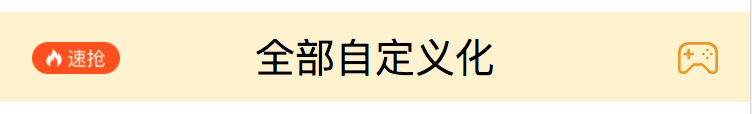
<wxc-minibar background-color="#FFF3CD">
  <image src="https://img.alicdn.com/tfs/TB1QN8pdlHH8KJjy0FbXXcqlpXa-220-80.png"
         slot="left"
         style="height: 32px;width: 88px;"></image>
  <text style="font-size: 40px;" slot="middle">Customize this component</text>
  <image slot="right"
         src="https://img.alicdn.com/tfs/TB1j39Uc0fJ8KJjy0FeXXXKEXXa-160-128.png"
         style="height: 32px;width: 40px"></image>
</wxc-minibar>
// @wxcMinibarLeftButtonClicked="minibarLeftButtonClick"
// @wxcMinibarRightButtonClicked="minibarRightButtonClick"