[BUG] bar charts scales are inconsistent when type: 'time' and unit: 'week' OR 'month' #3747
Comments
|
This is causing us some issues for us as well, especially when bar + time series is used in conjunction with the zoom plugin (due to ticks changing). From what I understand the bar width is calculated off of the # of ticks which can change due to a number of factors. This works fine with line chart, as we only need to draw a single point but when used on a time axis the bar actually represents a range of data. It seems like the proper solution is to use some kind of new property such as "barUnit" which represents the duration of each bar. If the duration is set to "hour" then we can calculate the width regardless of zoom, tick setup, etc. with something like: Am I on the right track? I could work up a proof of concept but architecturally where does this fit? Should there be a new bar element specific to the time series? |
|
@tuckwat I think you might be on the right track. I think the code would somehow live in the bar controller and the axis. Architecturally this is hard to fit in, since we really want the controller class to be agnostic from the scale if possible. There is already a concept of a fixed bar size in pixels, so maybe this could be in there. The relevant code is https://github.com/chartjs/Chart.js/blob/master/src/controllers/controller.bar.js#L182-L184 Maybe a specific bar type for these kinds of axes is the way to go, or maybe all axes need to have a specific bar interface that gives some nice properties for creating the bars but this leads to other questions like: do we bin data that falls inside a bar? How do we auto size the bars? etc. Tagging @simonbrunel @tannerlinsley @derekperkins @panzarino for their thoughts |
|
@benmccann @simonbrunel I tested with 2.7.1 and this looks a lot better. https://jsfiddle.net/gh21s6vw/1/ I struggled to get the bars evenly sized (barThickness: Number was the only way). I thought there was a setting at one point to make them evenly spaced? Or am I mis-remembering that? Also, I thought the bars at the ends would not be truncated when |
|
@etimberg I think evenly sized bars is supposed to be the default now since #4994 was submitted. Perhaps there's a bug. What do you think @simonbrunel? |
|
I am trying to plot bar graphs with type = time
(I hacked the jsfiddle above into my example, I am poor at JS, as I am working with TS, so hopefully I did not do something awfully wrong) I fed the dates/time x values as strings like so '2018-1-21 12:00' Here is the demo of the issues with bar time scale rendering weird ??? When I try scatter with type=linear I get a more accurate plot, with OK auto x-min-max labels. Most importantly the x-values, I fed as raw integer values 0..2359, are positioned correctly against the xAxis, like this one: Regarding the bar chart, setting distribution:series/linerar does not seem to affect things either. Thank you. |


|
I was on 2.4.0 added A ticks' step size within the time object seems to be supported. I set to 360 but I don't know what it actually means (minutes/seconds) ? Here is the code...
Getting better, but far from correct
|

Evenly sized: #4994 (v2.7.2) is not released yet - fiddle
Evenly spaced: #4582 (v2.7.1)
Bar offset: #4545 (v2.7.1)
I think #4994 is the fix you need but it's not release yet - fiddle
It's almost equivalent to setting |
|
Ah cool, forgot that #4994 is in 2.7.2. Once that's released I think this can be closed 😄 |
|
I verified that this was fixed in 2.7.2. Regarding the x axis label issue, use the formats supported by moment.js. For example, '2018-1-22 0:0' is not supported, but '2018-01-22 00:00' is. |
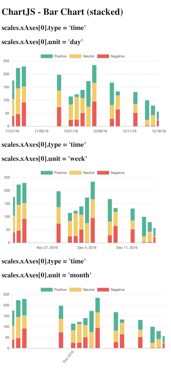
Expected Behavior
I expected the graph chart to remain consistent, and for only the xAxis time format to change.
Current Behavior
The xAxis scale seems to increase too much, and data is lost in both the week and month (more than week) charts.
Clumping the bars together as a week or month metric seems to be the root of the problem.
Possible Solution
I suggest that when bar charts (stacked, or not) have
type: 'time'configured, display the bars as days, keeping the chart graph itself consistent, and only change the axis labeling (days, weeks, months).We need to ask ourselves if we think this is working as intended or not. Here are my opinions
Leaving it the way it is (clumping up data by week/month)
Pros: ??
Cons
Making a special case for bar charts with the 'time' configuration always display the chart in day bars
Pros:
Cons:
Maybe we can avoid the last con by adding another configuration option that gives us the ability to be flexible with how we want the chart to render.
Steps to Reproduce (for bugs)
Context
I'm trying to represent data with a clear bar chart, provide 3 options for the xAxis scale labels (days, weeks, months).
Environment
2.4.0Bar Chart (stacked)
https://jsfiddle.net/5y0rk63a/
This demo shows a big difference in the way the chart is rendered when the scale unit differs.
Bar Chart
https://jsfiddle.net/5y0rk63a/1/
This demo is fork of the stacked bar chart, with hopes to further isolate the root cause. It contains a single dataset, and does not stack any bar data.
The text was updated successfully, but these errors were encountered: