-
Notifications
You must be signed in to change notification settings - Fork 384
New issue
Have a question about this project? Sign up for a free GitHub account to open an issue and contact its maintainers and the community.
By clicking “Sign up for GitHub”, you agree to our terms of service and privacy statement. We’ll occasionally send you account related emails.
Already on GitHub? Sign in to your account
On the single error term page, apply a similar UI to the single URL details #1449
Conversation
John had created a nice display of the details,
which expands on clicking the 'Error' row on the single URL page.
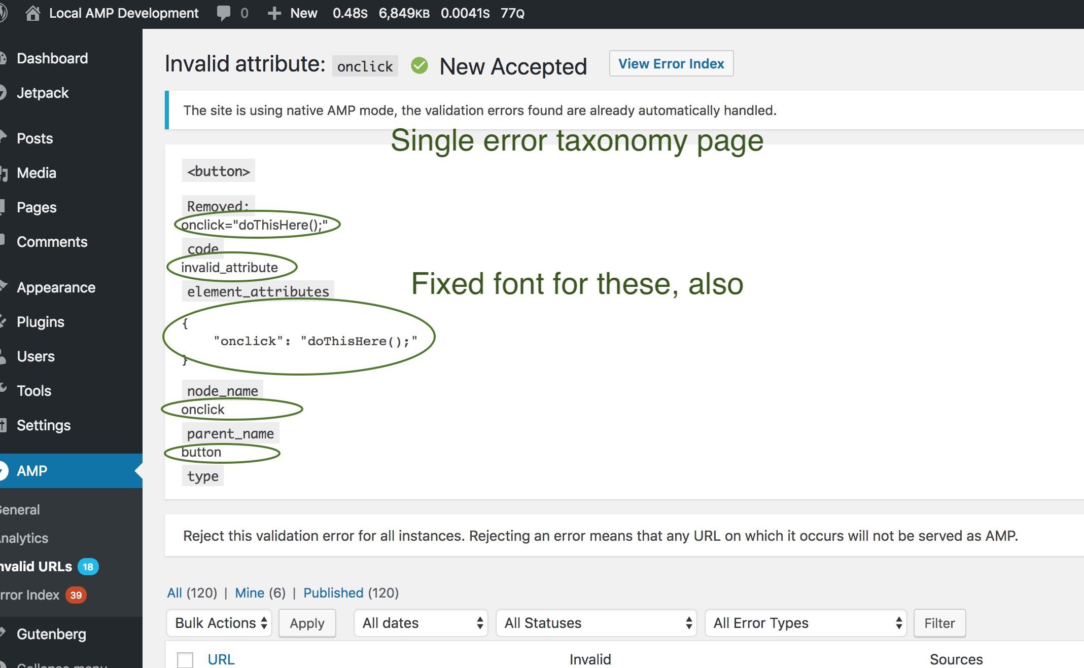
This begins to apply it to the single error term page.
|
Request To Work On This Hi @johnwatkins0, |
|
@kienstra I think this certainly looks better than the red/blue colors: More alignment between the two styles is needed of course. Perhaps it should consistently be fixed font for keys and values? |
|
Hi @westonruter,
Good idea. Is this what you had in mind? |
|
@kienstra Each value should be have a fixed-width font, and the values should be indented as well. No need for the braces or the quote marks. For the nested children, in that case the key can just be bold with the value not-bold. The top-level keys could have the gray background like you show above. Disclaimer: I'm not a designer. |
|
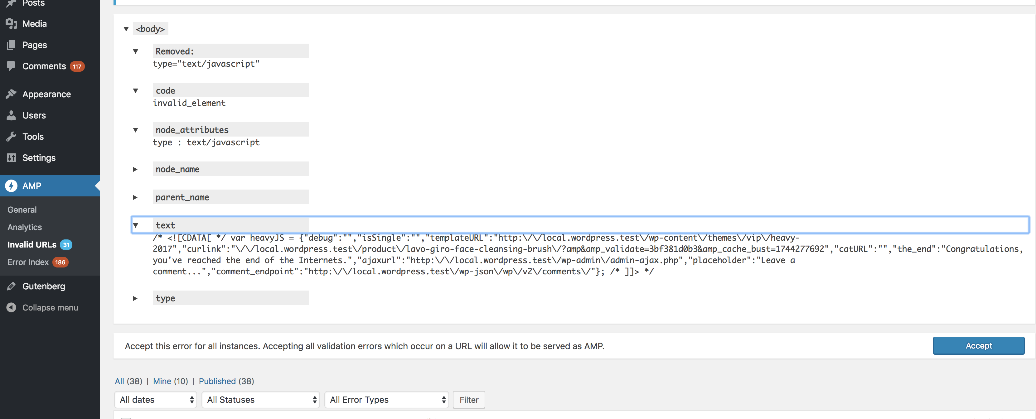
@westonruter @kienstra Here's how it looks with the commit just pushed: |
|
Based on @westonruter comment a little while ago, I'll change "text : javascript" to "text: javascript". |
|
Thanks, @johnwatkins0. This looks really good. |
|
@westonruter This is ready for your review. |
| @@ -1903,8 +1903,15 @@ public static function render_single_url_error_details( $validation_error, $term | |||
| <div class="detailed"> | |||
| <?php if ( is_string( $value ) ) : ?> | |||
| <?php echo esc_html( $value ); ?> | |||
| <?php else : ?> | |||
| <pre><?php echo esc_html( wp_json_encode( $value, 128 /* JSON_PRETTY_PRINT */ | 64 /* JSON_UNESCAPED_SLASHES */ ) ); ?></pre> | |||
| <?php elseif ( is_array( $value ) ) : ?> | |||
There was a problem hiding this comment.
Choose a reason for hiding this comment
The reason will be displayed to describe this comment to others. Learn more.
There was a problem hiding this comment.
Choose a reason for hiding this comment
The reason will be displayed to describe this comment to others. Learn more.
Addressed with 5ebc340:
There was a problem hiding this comment.
Choose a reason for hiding this comment
The reason will be displayed to describe this comment to others. Learn more.
Thanks for catching that, @kienstra
There was a problem hiding this comment.
Choose a reason for hiding this comment
The reason will be displayed to describe this comment to others. Learn more.
All good, thanks a lot for applying this UI.
…single term page

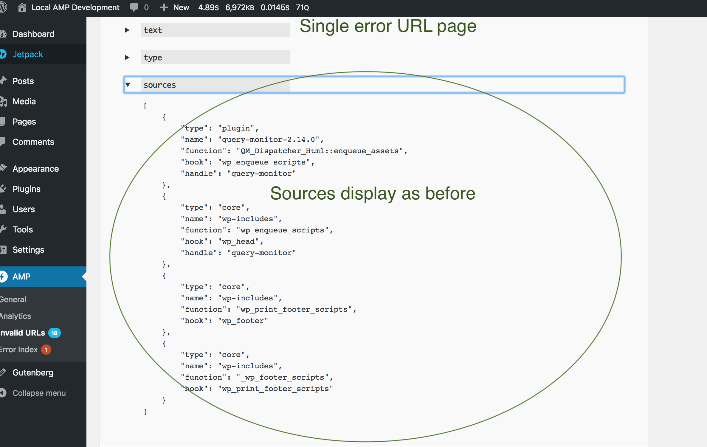
Before, sources were output with wp_json_encode(),
using a pretty-print constant.
Because they don't appear on the single term page,
this commit shouldn't affect that.
But restore the old means of outputting the sources
for the single error URL page.
|
…pdate/single-error-details
|
…mattic/amp-wp into update/single-error-details
|
Just pushed changes for the following:
@westonruter, on "For the details on the removed, why are the angle brackets removed?", that field is the attribute key and values concatenated to look like the removed attributes. I suppose the element could be prepended (with angle brackets) to make it look like an actual element, but I'm not comfortable enough with all the different conditions to make that happen. |
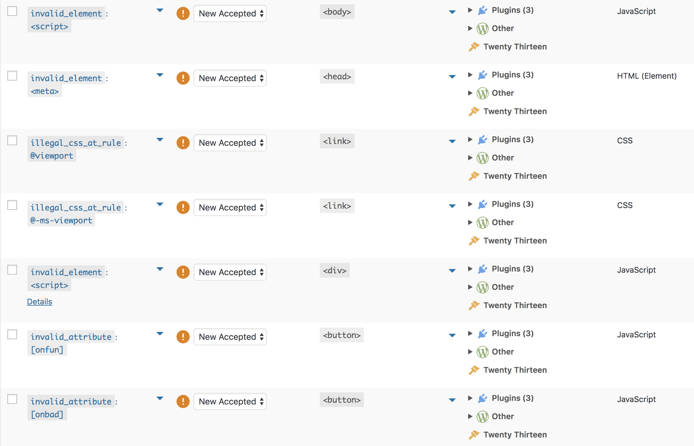
Here's what I'll push that uses a For an invalid attribute: |


@johnwatkins0 had created a nice display of the details, which expands on clicking the 'Error' row on the single URL page:
Something similar to this should be applied to the single taxonomy term UI: